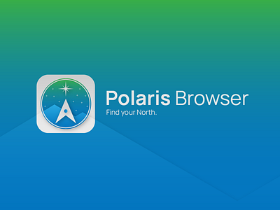
Polaris Browser: Icon
A few thoughts i feel like sharing:
Browsers remind me of navigation. And navigation reminds me of cartography, which reminds me of the Polar star... I think it gets very self explanatory after that.
The Colors are blue to represent cold and reliability, and green to represent the Aurora Borealis phenomena.
The font used in this exercise is Manhope, Bold and Regular.
Shoutout to:
Arthur Bauer on Noun Project
Ralf Schmitzer on Noun Project
More (in Brazilian Portuguese):
Miangelo Designs on instagram
Miangelo10 on Behance
More by Mikael Angelo View profile
Like

