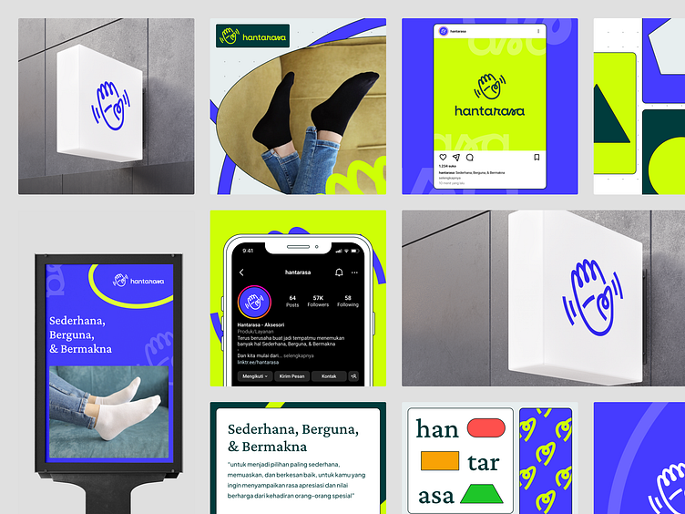
Hantarasa - Retail Accessory Company - Brand Guidelines
Client Background and Challenges
Hantarasa is an accessory retail company that provides various accessory needs. Hantarasa has its own guiding values within the scope of its brand, which it wants to implement and convey to the audience through a visual identity. Hantarasa believes that visual identity is one of many factors to build a strong brand identity.
Hantarasa's target audience is young adults. The activities that young adults need to do vary widely. However, in all these activities, many of them require various accessories. Hantarasa wants to be an easy choice for them. Providing accessory needs, such as socks, belts, wallets, and other functional accessories. By looking at the various activities that the target audience needs to go through, Hantarasa strives to provide a simple and convenient customer journey flow, so that convenience and satisfaction can be achieved.
With this, Hantarasa perpetuates its value in its tagline, which reads "Simple, Useful and Meaningful". Simple options that are easy to find. Can meet the needs and solve problems of the target audience. And with the simplicity of what has been provided, it is hoped that it can support and provide greater meaning.
Solution Idea and Design Process
The idea of designing Hantarasa's brand identity is "as it is" and "meaningful". The visual impression that you want to display in your own visual identity is striking, but still simple. It becomes a challenge in making Hantarasa's visual identity, because it is necessary to combine various design elements, while maintaining simplicity but still standing out.
Simple here is not something with minimal elements in a design result. Not that minimalist. But more to give a visual picture of the "usual" things. Because of this, the design direction created is to use simple and handcrafted elemental shapes. Among them using simple flat shapes such as squares, circles, triangles, and others. In addition, using several visual elements in the form of scribbles, as well as strokes of lines as if they were crossed out directly by our hands.
Simple object shapes, circular lines, and continuous lines serve as a guide in the design concepts created. And besides that, all of this is supported by colors that are still guided by the idea of "as is" and "value", as well as a striking but still simple visual impression.
Outcome
In the early stages of building Hantarasa's brand identity, in this case more specifically on visual identity, the output is in the form of Visual Identity Guidelines. Inside, it briefly contains guidelines on logos, colors, typography, and graphic elements.
There is a more detailed explanation, as well as recommendations that are continued in the Visual Identity Guidelines that were made. The goal is to maintain the visual appearance of all of Hantarasa's designs later. Which is possible if the process is delegated to another party, there is a guide in making the design that will be made. So that the consistency of Hantarasa's visual identity is maintained.
__________
What do you think about my design? I hope you enjoy it.
Feel free to leave comments and feedback. And if you find my work useful and you like it, please don't forget to leave a love and save it.
Thank you! Have a nice day ✨
__________
We are available for new projects
📪 Email: hello@vektora.studio
🎯 Skype: Keep in touch 😀
👋 Instagram: Vektora.studio
🛍️ Ui8: Vektora Shop
💰Gumroad: Vektora Gumroad
🏄♀️ Behance: Vektora Behance


