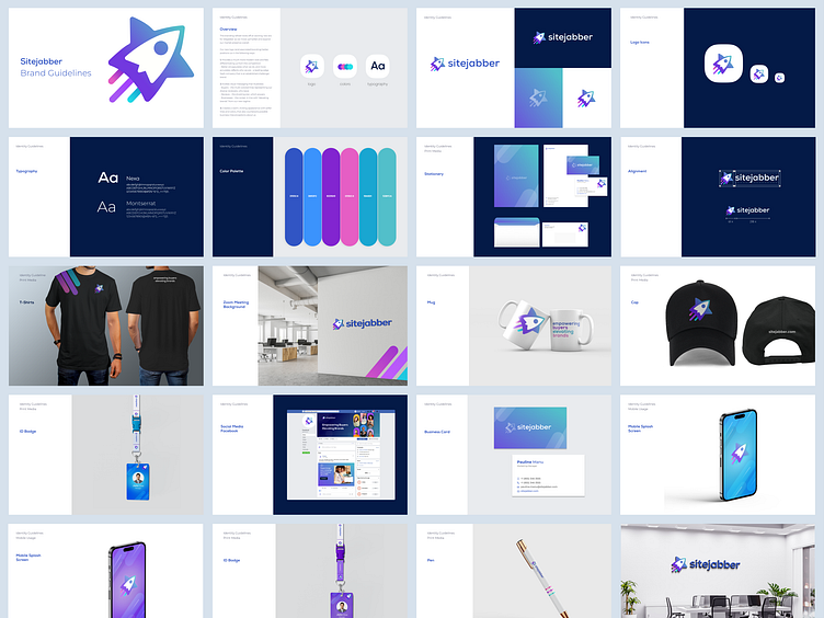
Brand Guidelines
Rebranding
Branding refresh kicks off an exciting new era for Sitejabber as we move upmarket and expand our market presence overall.
Provides a much more modern look and feel, differentiating us from the competition - Better encapsulates what we do, and more accurately reflects who we are - a leading-edge SaaS company that is an established challenger brand.
Evokes visual messaging that illustrates: - Buyers – the multi-colored lines representing our diverse reviewers, who leave - Reviews – the shooting star, which powers- Businesses – the rocket, in line with “elevating brands” from our new tagline
Creates a warm, inviting appearance with softer lines and colors, that also counteracts possible business misconceptions about us.
https://drive.google.com/file/d/18mxMve6aq1CJ7MQzBeuOhZYx7PQiKM7Q/view
