Fitness Hack logo design + branding
Fitness Hack logo design + branding
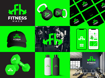
Fitness Hack is a gym focused on both men and women fitness. Their vision is to be the go to place for fitness and health articles, training programs and workout equipment.
I've designed a logo that is not too masculine nor too feminine as it represents both mean and women. I've created the icon combining the letter "F", letter "H" and dumbbell in a creative way. I've also used the color green to symbolize freshness and renewal.
I would love to hear your feedback on the design.
Want to work with me?
