eos Design System – Tokens & Components
What is EOS
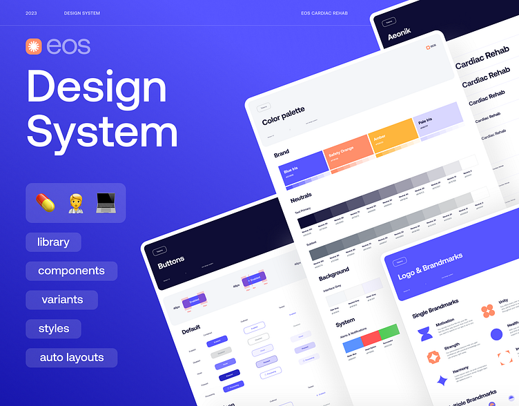
Tablet app that makes the rehabilitation process easier. EOS combines supervised exercise training, heart-healthy nutrition, and medical education in one product, designed for cardiac rehabilitation. Real-time exercise supervision, improving eating habits, and decreasing risk factors.
EOS Design System
Eos design system is created for existing services and needs to be standardized product UI elements for growing and appending new features.
Building a design system for Medtech software and apps is crucial for ensuring consistency, efficiency, and usability across the entire ecosystem of healthcare products.
Styleguide & Grid
Simple base elements like bold colours & typography are the foundation of the entire system. Responsive layout grids for Desktop, Tablet, and Mobile are used here to assist us in aligning page elements based on sequenced columns and rows.
Spacing System
My preferred method is an 8pt linear scale for elements and 4pt for spacing icons or small text blocks. I have used the 4pt baseline grid for my typography which means the line heights of the font are divisible by 4. The spacing system allows a product to be more consistent.
Components and UI kit
The molecules are a simple system created by basic elements. Those elements can take many forms such as buttons, inputs and cards. The user interface is a collection of assets containing design elements such as UI components and Styles. UI components are elements that convey meaning and provide functionality to users.
Icon Design
Creating the Icon family requires a thoughtful approach and a bit of iteration to activate its seven principles: Clarity, Alignment, Brevity, Consistency and Ease of use. By optimising the user interface and experience for mobile devices, healthcare providers can access critical patient information, medical records, and diagnostic tools anytime, anywhere, enhancing workflow efficiency and patient care delivery.
Check the fully completed case study on Behance!
Contact me:
✉️ email: fiona.bui.uk@gmail.com
📮 telegram: @fionabui
Follow for more:


