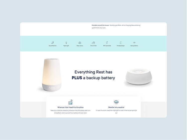
Hatch.co website section design exploration.
An exploration of the possible improvement of the "Everything Rest has PLUS a backup battery" section on the Hatch.co website.
Hatch.co offers an upgraded version of their "portable dream machine" as Rest+.
Upon researching the product and company, I noticed that a website section wasn't using an image that supported the subject line. Which is that: with Rest+ you get a backup battery for your device.
This prompted me to reconsider a way to actually complement the statement that was being made with an image of the product and "battery" (the left image used is of the Hatch Rest Mini, not the battery itself, but it looked close to something that would look like a battery hence why I used it as that) itself. This new design allowed the users to understand the value of this extra feature they get in a visually pleasing and comprehensive way. The image before felt like a placeholder to me, with no actual bearing on the topic of the section.
Gallery slide showing the updated section design:


