Arches Consulting_ Logo design
Introducing Arches Consulting, a pharmaceutical consulting company dedicated to helping clients navigate the complex world of pharmaceuticals. They have commissioned a new and memorable logo to support their brand and stand out in a crowded market.
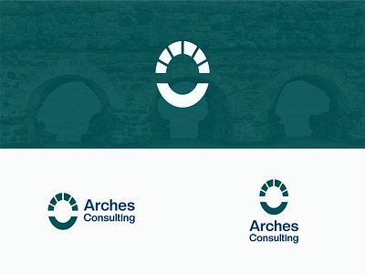
The logo features an abstracted circle arch as the icon. The use of arches in the design is a nod to the company's name, "Arches Consulting," and also symbolizes the stability, support, and protection the company provides to its clients.
The color scheme chosen for the logo is a dark shade of green, which is often associated with growth, health, and healing. This aligns well with the company's mission of helping clients navigate the pharmaceutical industry. Additionally, the navy blue text of the company name "Arches Consulting" sits underneath the green icon, creating a good contrast and sitting well on the right side of the icon.
One of the key elements of the logo is that it looks good with or without the text. This allows the company to use the icon on its own, such as on social media or on small promotional items, while still being easily recognizable as the Arches Consulting brand.Overall, the new logo for Arches Consulting is not only memorable, but also symbolizes the company's values and mission, and will help the company stand out in the competitive pharmaceutical consulting market.
-
Open to work
For Inquiries: creeventer@gmail.com
Hello in WhatsApp: +880 1707 471613
Thank you.
