E-Learning Dashboard-Light Theme
Hey everyone👋
This is my recent exploration of a e-learning dashboard that I'd like to share with you. Throughout this post, I'll describe each section and my thought process.
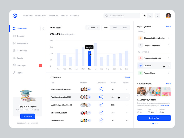
Sidebar)
The user should be able to collapse the sidebar. As a result, they are able to focus on the main sections of their interest.
To increase sales and premium, I also wanted to use an illustration to grab their attention.
Illustration by Icons 8 from Ouch!
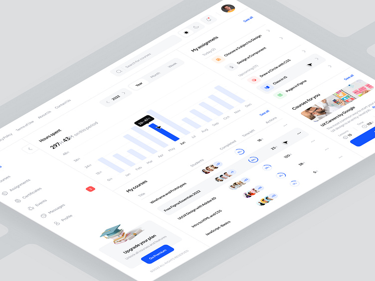
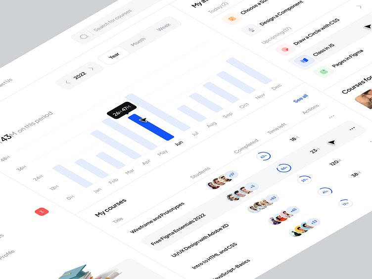
Chart)
To me, it was important that users could switch between different time periods to check their performance. It's also extremely important to see total hours spent during a given period of time, so that users can set goals for themselves and improve performance.
Courses)
It is essential for an e-learning platform to show users which courses they have enrolled in. Keeping the design clean and minimal, I tried to display the maximum number of courses in as little space as possible.
...Scroll Down...
Assignments)
For me, not only do I need to see my assignments, but I also need to know what assignment I have to do today so I can plan well and go faster.
Suggested Courses)
The purpose of this section is to get the user's attention once again and this time I do it with the help of a picture. By enrolling in more courses and learning more, users are more likely to engage with the platform, thereby increasing its community, which is a win-win for everyone!
Please let me know what you think about this design 😊
Don't forget to support!
❤️ Like | 💬 Comment | 💾 Save | ⏩ Share
We design Everything at 360° 😎
Follow Obtic™
Instagram • Behance • LiknedIn • Twitter
Interested in our work? Just drop an email 😍
