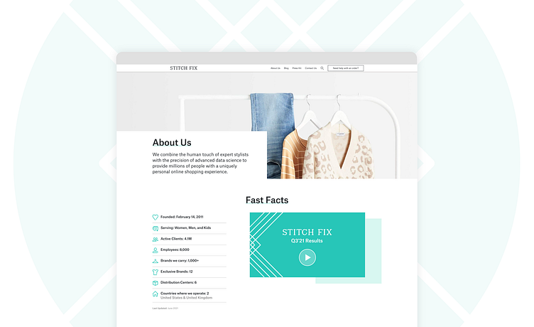
Stitchfix Newsroom Redesign
The team at Stitchfix wanted a refreshed, modern, and open feel to the newsroom that was currently feeling a bit stale. The updated site includes more vibrant color and imagery to bring the stories featured on it to life and highlight the Stitchfix brand more directly in a lifestyle application. The newsroom page can be seen here: https://newsroom.stitchfix.com/
Updated Homepage
Page Layouts
More by Jeffrey Boese View profile
Like


