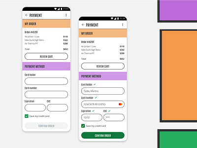
Credit Card Checkout - Daily UI #2
DAILY UI Day 2
Style: Neo-brutalism
Time: 40min
Process:
Research: I searched about the new UI trends and I need to confess, was really hard chose one. But, my criteria was getting out from my comfort zone and create something possible to implement because almost all payment screens are a little bit fixed, it's an e-commerce plataform thing, and we need to build confidence in our user, because they need to give us personal data. So, I chose the neo-brutalism but I changed some little things, so I did a minimalist neo-brutalism. Is it a antithesis? hahaha
Wireframe: I started to draw some wireframes inspired by some benchmarks from Mobbin, Dribbble and Pinterest.
Bulding: I used ready components from a internal Design System and adapted for the style I chose. Building the screens, I was not comfortable with a lot of colors, so I used the colors in key components, like subcategories headers and buttons, and using geometric form and a heavy font to make neo-brutalism present on my creation.
-
Attention point: One of my pains is combining fonts, so I was a little concerned about my combination (Antonio + Open Sans), but I didn't want to waste more time thinking about it, so I accept critiques about this question and about all the work :)
