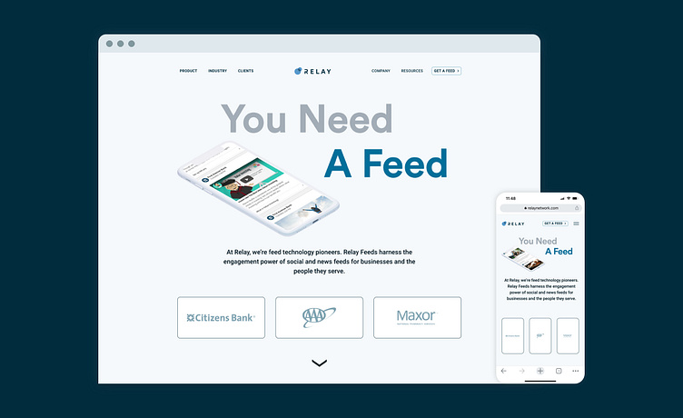
Relay Network Website Redesign
Business communications company Relay Network brought a marketing and brand challenge to myself and the team at Flickerbox: completely reimagine our site based around the idea of a mobile content feed. This redesign placed the focus on the new Relay Feeds product approach and expanded the scope of a traditional corporate website. We wanted to provide a novel approach so that the site was big, bold, and easy for users to navigate, just like they would using a Relay Feed. Colorful layouts, highlighting the various integrations and features of the product were paired with seamless animation and diagrams that took the user through the journey of experiencing all that the company had to offer. The new website can be experienced here: https://www.relaynetwork.com/
Initial Site Concepts
Exploration for the Homepage and overall website direction included lots of open space, color, and integrated animation aspects to bring the experience depth.
Brand System Components
The refined brand identity system included new colors and fonts that introduced a more high-tech and innovative approach to the brand and marketing language.


