ACRE: Branding, Logo design, Visual identity
ACRE
ACRE is a real estate company. Their vision is to create robust and modern construction for the next generation.
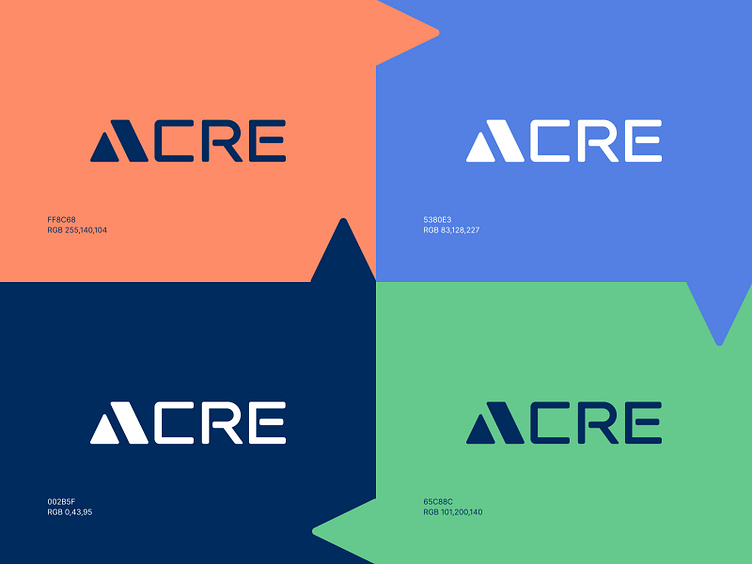
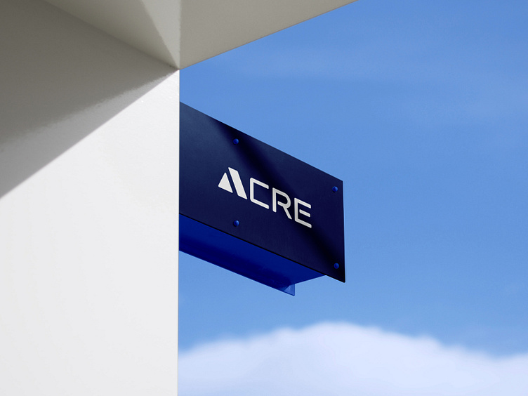
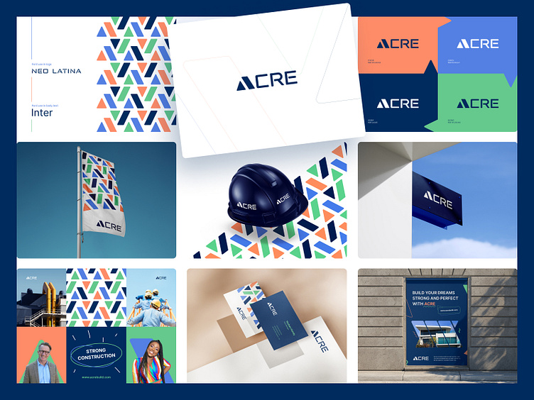
About the ACRE logo: When we got ACRE's branding proposal, our challenge was to create a unique logo. Since ACRE has only 4 letters we didn't generate a combination beige logo, we wanted to create a wordmark logo. And we managed to make it, and the logo of ACRE is made where the letter A + home icon exists.
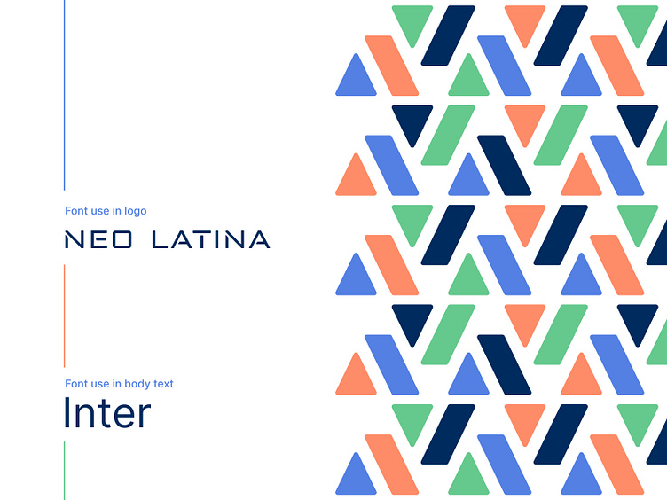
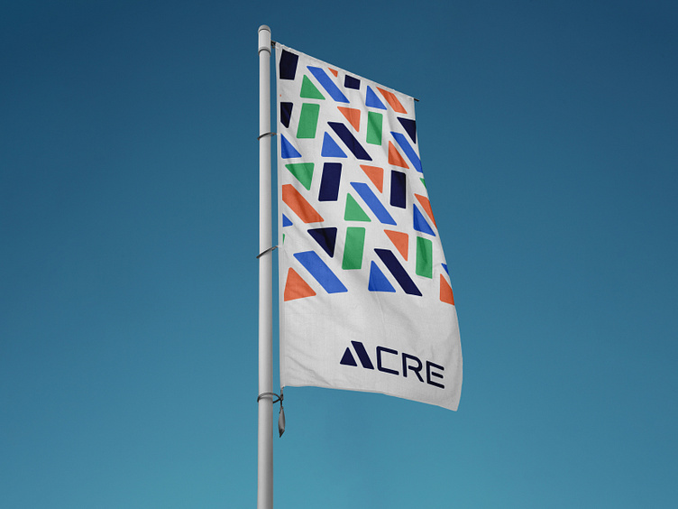
Color: As a primary color, we have used Cool Black in the logo. And other colors were Atomic Tangerine, United Nations Blue, and Iguana Green. 4 colors together make the work beautiful and unique.
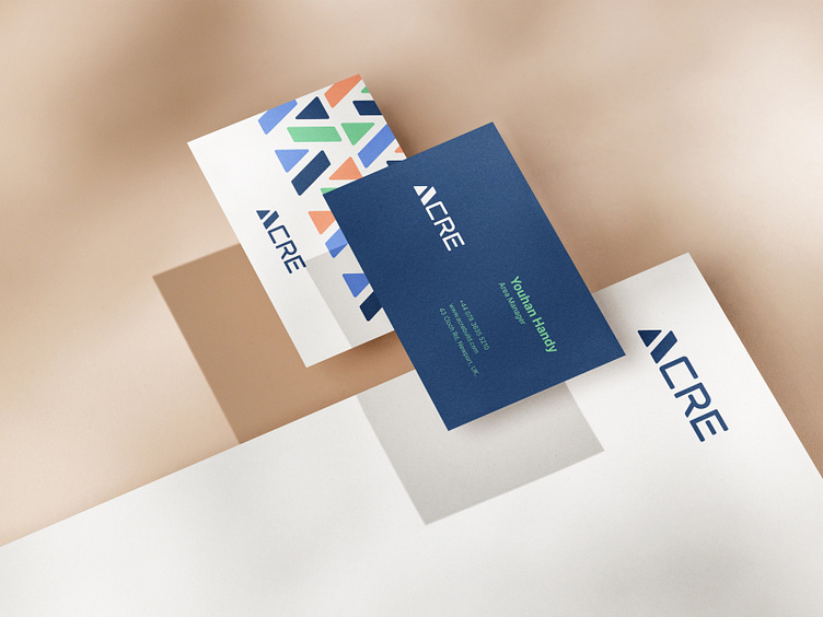
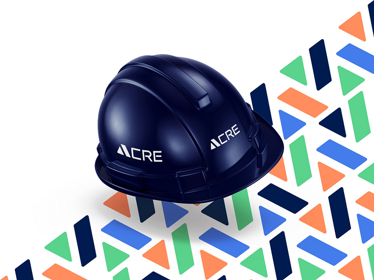
Branding: For branding, we always prefer logo icons. We created a pattern from ACRE's logo icon and used it in branding. So that people can be familiar with ACRE's logo. And added some more graphical elements to make the branding look eye catchy.
Who are we?
Kahaf is a dynamic and trendy design service agency. We usually help tiny & extensive companies to do Logo, Branding Design, UI/UX design, Mobile apps, and Product design. We receive the entire design process and think out solutions that work for businesses and users. Finally, we are cautious about work deadlines.
Let's start a project: hello.kahaf@gmail.com