Educator Portal Navigation Redesign
Project Overview
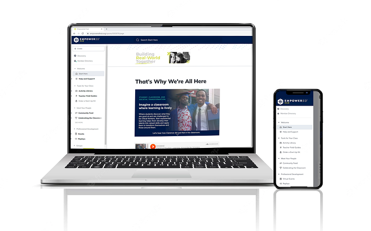
Empowered Hub is an educator platform and community app that connects change-making educators to learn and grow with each other as they transform their classrooms into engaging experiential learning experiences for their students.
My Contributions
In this re-design, I worked with a multi-disciplinary team as the Product Manager, leading our team through an 8-week sprint. A member from each product line was included in the team for feedback or designing purposes. In this project I was responsible for:
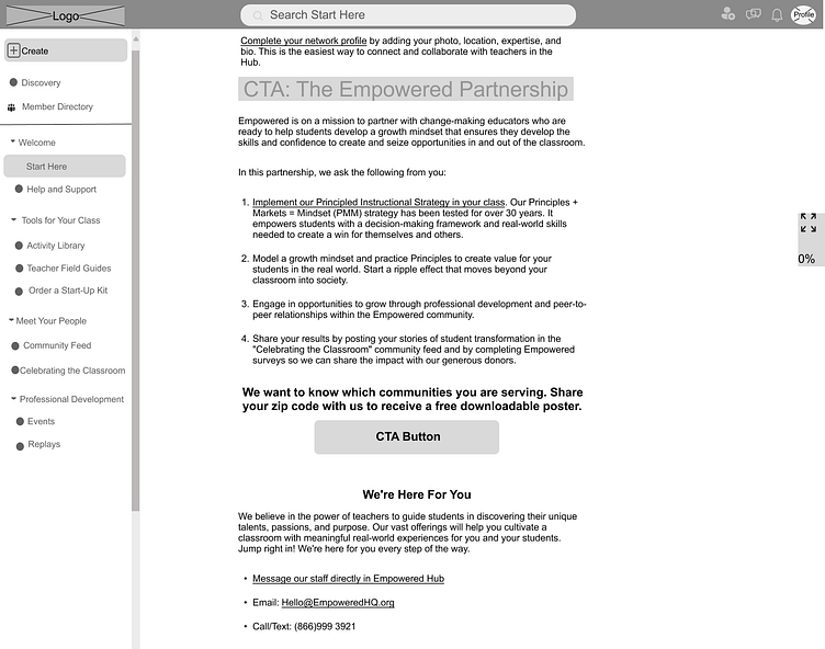
Building a new user-friendly navigation experience.
Creating a new onboarding page.
Identifying where to add a new call-to-action that the organization needed from users as a data point.

Defining the Design Scope:
I started the project by connecting with each product lead stakeholder and gathering their feedback on how the educator portal was currently showcasing their product line and how it could be improved upon/better measured. During this time, I also analyzed over 2,000 qualitative responses from our current educators utilizing the educator portal and what they hoped to get out of it when joining. These two key data points helped prioritize the new navigation and wording that would better encompass how, to begin with, showcasing Empowered's suite of offerings (the product).
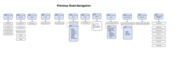
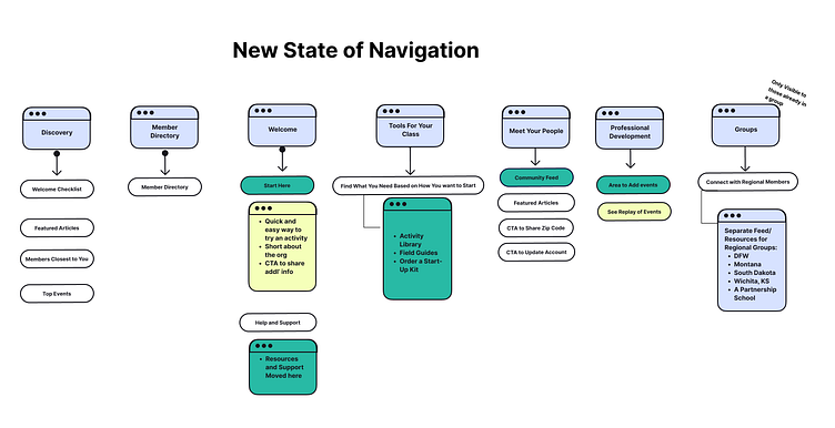
Defining the New Navigation Hierarchy
In the previous state, we were working within the limitations of our software partner's navigation making it difficult to share Empowered's educator suite of offerings in an easy and intuitive way. In the first slide you can see the previous state of navigation and in the second slide an outline of what the new navigation would look like.
The prioritization of the navigation hierarchy was determined after reviewing over half of our educators responses of what they expect to gain when joining the educator platform (the Hub).
Ed. Resources to implement in their classroom
Community, Advice and Support from other teachers
Tools that Improve Student engagement
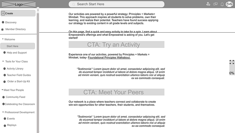
Defining Onboarding Page needs
Taking into account the level of knowledge that our users have about empowered's suite of offerings and now combining that information with answers from the question "what do you hope to get out of the hub" we can further make assumptions of how the onboarding "Start Here" page would be constructed to find a win-win between what educators are looking for and what Empowered has to offer.
Top 3 Market Asks of what they hope to get out of the hub:
Innovative/New Ed. Materials to Add to Toolbox
Community Network, Advice, and Support
Improved Student Engagement, Relationships & Classroom Management.
The first iteration of the landing page was constructed with the above data points in mind and the Empowered team's goals/pains/wishes of the hub at present.

Low-Fidelity Wireframes: Navigation and Onboarding Page
These next few slides outline what the new navigation would look like and the onboarding, "Start Here", page for teachers.

Gathering Feedback
I then held in-person feedback sessions with each of our key product stakeholders to provide feedback on the new navigation and the onboarding page to determine if the first iteration was meeting the mark. Below you can find a summary of the feedback shared by product capability.

Iterating our Way Forward
After combining the team's feedback it was time to bring it all together. The main pieces of feedback that were implemented included:
In the “Start Here” page:
Adding current educator testimonials and experimenting with a voice recorded story of an educator.
Moving CTA of trying an activity earlier.
Removed other CTA's that weren't relevant for an educator that wasn't sure if they were ready to commit additional time like, RSVPing to an Event.
Added email and phone number options to the support section.
In the prototype of the navigation:
Deleted sections that felt like Empowered was being top-down rather than partnering with eductors.
Re-organized the “Tools for Your Class” collection with Activity Library first.
Re-named “Community Feed” to “Meet Your People” to include more of a CTA in the title of the navigation.
Improved and simplified the Welcome Checklist like removing additional articles that weren't relevant to a new member.
Final Prototype
After applying the newest feedback, it was time to go live and test the final deliverable with our current educator network. Below you can find a video tutorial that was used to share with our community of educators.
We are currently still in the process of collecting feedback from educators about their new experience and continue to make small tweaks to the portal to continue improving user experience.
