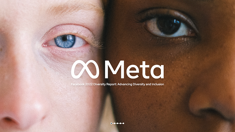
A New Look for the New Meta: Diversity Report Design
The PowerPoint template design I developed for Meta's Diversity Report was a freelance project that allowed me to help shape the early visual direction of Meta’s brand during its pivotal transition from Facebook. As part of a select group of designers worldwide, I was tasked with creating templates that embodied Meta’s new identity and aligned with Mark Zuckerberg’s ambitious vision for the Metaverse. My approach was to deliver a modern, clean design that would resonate within Meta’s evolving digital landscape while effectively showcasing their diversity initiatives.
Objectives
Align with Meta’s New Brand: Develop a template that reflected Meta’s fresh identity, with design elements that felt futuristic yet approachable, in line with the Metaverse vision.
Modern and Minimalist Aesthetic: Create a clean, sophisticated design that would communicate information clearly without distraction, allowing the content of the Diversity Report to take center stage.
User-Friendly Template: Design the template to be adaptable and easy to use for future reports, accommodating the needs of Meta’s in-house team.
Process
Research and Brand Immersion: Studied Meta’s new brand identity, exploring how its emerging visual language could translate into presentation format. This included understanding the clean, minimalist direction Meta was taking and how it could reflect the inclusive, forward-thinking values of a Diversity Report.
Design Execution – Futuristic Simplicity: Focused on crafting a layout that balanced sleek design with readability. I used ample white space, subtle gradients, and bold typography to ensure a clear hierarchy, making complex data accessible while maintaining a futuristic look.
Metaverse-Inspired Elements: Integrated design elements that subtly referenced Meta’s vision for the Metaverse, incorporating clean lines, immersive gradients, and modular layout structures that hinted at a digitally connected future without detracting from the report’s serious content.
Template Adaptability: Designed the template with flexibility in mind, ensuring it could easily accommodate updates and adjustments by Meta’s internal team for future diversity reports and other content.
Outcomes
Cohesive Brand Alignment: The template design harmonized with Meta’s brand refresh, presenting the Diversity Report in a way that felt both innovative and aligned with the company’s vision.
Engaging, Clear Presentation: The minimalist, modern aesthetic supported clarity and readability, helping stakeholders engage with the data and initiatives presented.
Long-Term Usability: The adaptable template structure offered Meta a long-term solution that could be applied across multiple reports and formats, providing a versatile asset for Meta’s internal use.
This freelance project for Meta was an opportunity to contribute to one of the first visual tools under the new Meta brand, and the result was a presentation template that echoed Meta’s future-oriented, inclusive identity while honoring the company’s diversity commitments.


