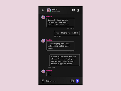
DailyUI #013 - Direct Messaging
Malibu Barbie, she is stylish, she has a vibe...
This is my #013 Daily UI design.
Design Hint 💻
Design a Direct Messaging app, profile, or chatbox. Consider the parties involved in the messages, images, placement, and context of the messages. Are the messages for social purposes? Customer support?
The Idea 💡
Step back in time and relive the nostalgia of the 90's with this screen. Allow yourself to be transported to a simpler era as we delicately accentuate the nostalgia of the past. Let's experience it together and see how it comes to life!
Final Thoughts 🧠
Are you ready to take a trip down memory lane? I present to you a dating app chat with a nostalgic twist, reminiscent of the iconic Barbie aesthetic and the early days of the internet. It's a blast from the past with an old-school vibe. Initially, the focus was on incorporating gradient elements, but in the end, it felt too sweet and a dating app should be accessible to everyone. So what do you think of this retro style? Will you join me on this journey to relive the nostalgia of the 90s?
Share the love, press "L" or "F" if you ❤️ my work!
If you want to stay up to date with my work, head over to my profile and follow me. 🎨
