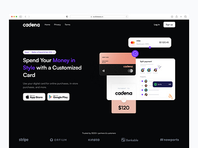
Landing page - Cadena Dark Variation
Dark mode lovers, check out this variation of the Virtual Card Landing Page concept I recently worked on. I was responsible for the UI/UX design and development, and I'm really excited about how the dark theme enhances the overall aesthetic of the page. This innovative solution streamlines the process of obtaining and managing virtual cards for businesses, making it easier than ever to conduct transactions and manage expenses. Let me know what you think! #dribbble #virtualcard #landingpage #UIUX #fintech #darkmode
More by Benjamin Onyebuchi View profile
Like
