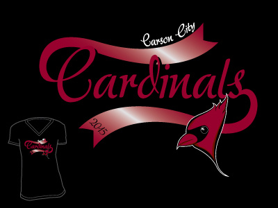
Ribbon Tails
I came up with this one because I think this typeface, Adore from Canada Type, needed something fancy, but could still have an application in women's team apparel. I also like tails, they're a classic apparel graphic element, but I wanted to do something new with a tail. The ribbon look achieved that and the gradient highlight gives some dimension to it. When changing a name drop, you always have to fuss with the tail to make sure it looks natural, but that top ribbon will have to be adjusted & possibly shifted based on the capital letter used and where the flourish is on that letter. Submitted for licensing to BruiserArt.com
More by Tessa Sainz View profile
Like
