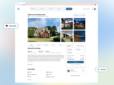
Redesign - Vacation rental website
The current version of rental details page is a bit disorganized, with pricing, taxes, and policies on one side, and links out to other pages such as availability and features at the bottom. Such content should be clear and organized.
More by Syazwani Atiqah View profile
Like
