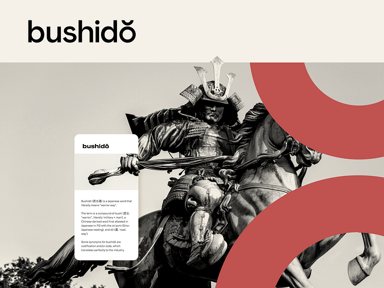
“What’s in a Name?” - A Bushido Story
In the world of branding, a name is more than just a word - it's the foundation upon which a brand's identity is built. So when former Agvokado came to us with the task of renaming their company, we knew we had our work cut out for us. But with a little creativity and a lot of strategic thinking, we were able to come up with a new name that not only accurately represents these guys, but also captures the essence of what they do and how they do it.
Challenges
Truth to be told, each project is a challenge on its own. So Bushido was not an exception. We had to:
• ensure that the name accurately reflects their focus on “becoming tested technology experts, ready to deliver”.
• stand out in a crowded market: There are many companies in the programming and development space, so it was important to choose a name that helps these guys stand out while at the same time represent their company culture. Tricky but not impossible!
• ensure the name is available and not already in use. This is to avoid any potential legal issues down the line.
Solutions
Finding the perfect name for a company can be a challenging and time-consuming process, but it is an important step in building a strong and cohesive brand identity. When we were tasked with finding the perfect name for our client's company, we knew that we had to approach the project with care and consideration.
First, we conducted extensive research to understand more about the client's business, their target audience, and the competitive landscape. We also communicated with the client to get a sense of what they were looking for in a name, including their preferences, values, and goals.
After generating a list of potential names, we settled on the name "Bushido". This name conveys a sense of honor, integrity, and discipline - values that are central to the company's mission and approach to business. We believe that this name will help to establish the company as a trusted and respected player in their industry.
Outcomes
The logo for the company Bushido is a simple yet powerful design that reflects the company's values and mission. The final letter O in the word is a circle which we used as a starting point for our logo proposals. The curvy line above the logo represents the emphasis of the word when pronounced in Japanese but it also represents upward and outward horns on the samurai helmet - sleek and stylized. The overall effect is clean and straightforward, conveying a sense of professionalism and reliability.
By creating a cohesive and consistent brand identity, we were able to help the company effectively communicate its message and connect with its target audience.


