Ignite Life: Full Design and Development
Ignite Life is a UK based charity supporting young people and their families to overcome adversity. They do amazing work providing mentoring and counselling services, as well as food support since the pandemic.
The Challenge
Ignite Life needed a new website to replace their old one which they had outgrown, there were several key challenges that they wanted their new website to solve:
The old website was hindering their ability to get grants due to its lack of accessibility
As a children's charity the website needs to be accessible to children
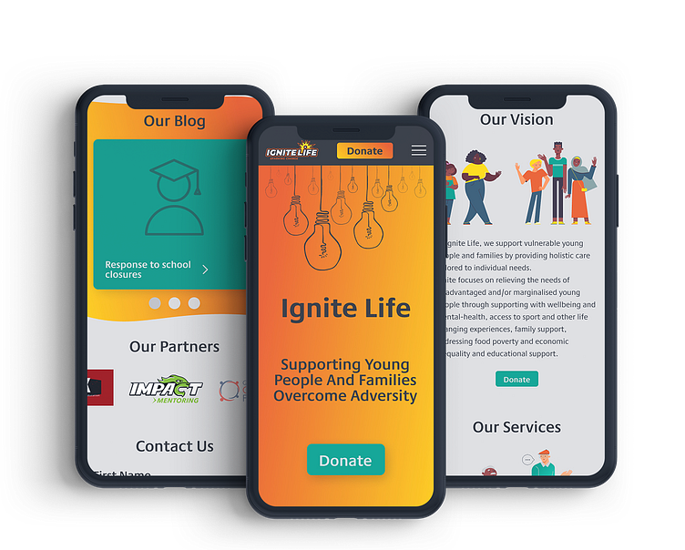
Make it clear what services are offered and make it easy to access these services
A completely new design that is more engaging and in-keeping with their brand identity
A colour palette based off of their existing logo, that would fit with their existing brand identity
Increase engagement with the website
Increase donation rate through the website
Move existing blog to the new website
Provide analytics that are understandable for the nontechnical
The solution
Design a website with accessibility as a core principle in all design decisions
Ensure the design was targeting the correct audience’s in the different sections, and accessible to all ages
Using UX best practises to create the information architecture
Take their existing brand assets and expand them to create a cohesive identity
Provided illustrations that fit the charities image and goals
Create interactive elements based off their existing branding
Strategically place calls to action to increase conversion rates for donations
Provide a full site migration from their old website to the newly developed one
Integrate Fathom analytics into their website, providing a dashboard for viewing and monthly email reports
Brand Development
While Ignite Life already had some brand assets, in the form of a logo and signature illustration, they wanted to create a more complete brand identity with a colour palette, typography and illustrations. These brand assets were all carefully chosen to be as accessible as possible and appealing to children.
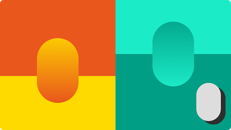
Colour Palette
All colours were tested to make sure that the majority of the time there was a AAA contrast rating, and that no text dropped below a AA rating. As well as this the design was viewed through several different filters simulating different types of colour blindness to make sure that it was accessible to all.
Typography
A Proxima Nova was select, due to its clean look and optimisation for being highly legible on small screen sizes, for almost all text to maintain visual simplicity and maximise ease of reading. The only exception were for H3 headings which Blockhead was selected for. This was to add a more fun font adding areas of contrast and helped reinforce the light hearted tone that the website portrays.

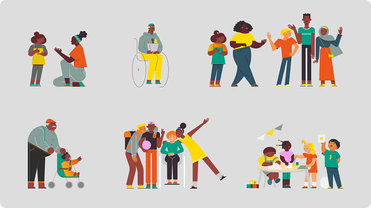
Illustrations
To fit the target budget, it was decided with the client that fully custom illustrations were not need, but instead creating custom scenes and adjusting colours of an illustration pack would be perfect. A simple and welcoming style was settled upon, that would appeal to all the target audiences, and then colours were adjusted to fit in with Ignite Life's branding.
Design System
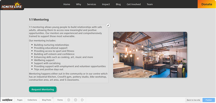
One of the key requirements for the website was that it would be easily updated and edited by the client themselves, who do not have technical knowledge. Webflow's editor makes the editing of content incredibly easy but to allow for easy creation of new pages and sections on existing pages a design system with reusable sections and components was created. This design system allowed for important or frequently reused components to simply be drag and dropped into place, and for entirely new sections to be created in seconds. To complement this system a CMS was built to make editing and creating new blog posts as easy as possible for the client.
To maximise user engagement and make the user experience more memorable, several elements were made interactive. The brand illustration of the lightbulb was selected to be the focal point of these interactions as they lent themselves to natural interactions and drawing additional focus to these areas would help with brand recognition.
The whole design was created with responsiveness in mind, to ensure that users of all the website would be able to experience it as it was designed to be.