Under Armour Mark Refresh
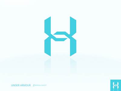
I have always viewed under armour as a more "hardcore" brand. Something that resembled hard work and determination. The logo has always felt a little too round to me as a consequence of that vibe. So in order to correct that, I made a fairly signifacant change that resulted in sharp points all the way around, giving it a tougher feel. I didn't want it to feel overly heavy, however, so I balanced the weights of the various legs and center pieces so that from a distance, it all appears similar. Even at a small size, the middle cross members feel proportionate to the legs and creates that clear "X" motif that under armour has always been know for. I also feel that the taller aspect ratio, along with the disconnected cross members helps to more clearly resemble the conjoining of the letters "U" and "A".
