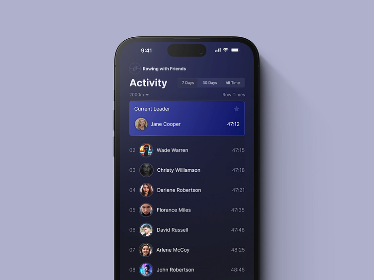
Typography Exercise: Hierarchy
I like where I landed with this exercise in terms of text hierarchy. The elements that I wanted to stand out: App name, page / view title, and current leader. I also explored different methods to filter leaders but found that the Segmented Picker (iOS) was the right approach. I may even prototype the interaction as a follow up. Let me know what you think!
Interactive Filter Prototype
More by Patrick Eustis View profile
Like
