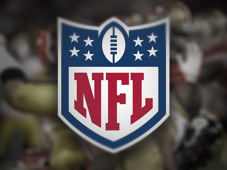
Nfl Shield Dribbble
This wasn't something I ever considered doing until I saw Justin's rebrand, but something about it just hit me and I had to give it a go.
I loved what he'd done with the lower portion of the logo, I much prefer his type treatment to the real deal, and the shape of the lower shield just felt more modern and appropriate to me. I've made a few subtle tweaks to the letters, extended the F down to fill the point of the shield a little better and put the serif back on the bar of the F.
I also loved the vertical ball he used, but I felt he'd missed a trick. The three points on the NFL shield are iconic to me and should never go, and the inner part of his logo, turned upside down gave a reason for those three points. The vertical ball creates the centre point. To me this gives the ball more purpose as opposed all other incarnations of the real logo where the ball sits at some random angle not really doing anything.
Anyway enough of my rambling, you can tell I haven't Dribbbled for months! First one back after wrecking my creative hand playing football in November. Hope you like it and would love to hear your feedback.
Steve

