CouchCast: Personalized TV Tracking
CouchCast is a user-driven platform intended to enable users to track, search, review and explore tv shows.
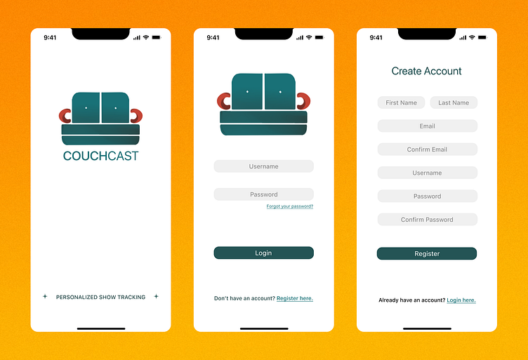

Splash Screen, Login, Registration

Functionality
The Splash Screen is only intended to be shown to the user for a second. It shows the app name and logo in a simple manner.
The Login Screen asks the user for their username and password. Should the user forget their password, they would be able to click on the "forgot password" button and begin the process to resetting their password once redirected.
If the user doesn't have an account they will easily be able to register and create a new one. Once they are redirected to the Registration Screen, the user will be prompted to enter their personal information. Upon completion, they will be redirected to the login screen once the Register button is clicked.
Design
The design behind these three screens was intentionally meant to be minimalistic. Too much information thrown at the user can be a little overwhelming and daunting. They may not want to bother with the application altogether if they are irritated from the beginning. Both the Login and Registration screens are simple and are not difficult to follow and complete.
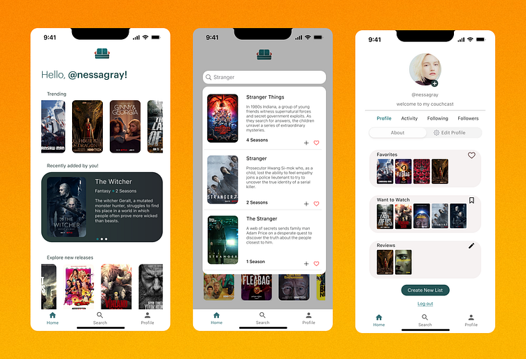
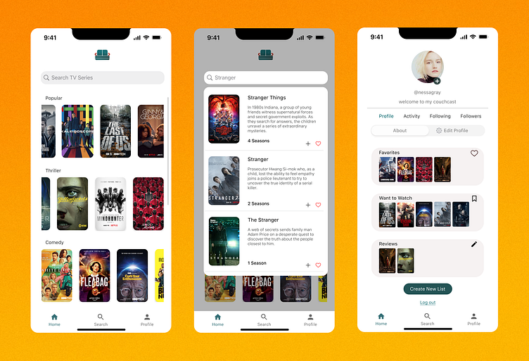
Home Screen, Show Cards
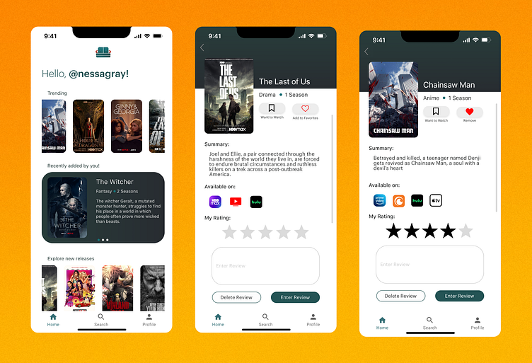
Functionality
The Home Screen allows the user to view trending shows, followed by a carousel of shows they have recently added to any of their lists. The carousel only rotates through the three most recent shows, and provides the show poster, the title, genre, number of seasons, as well as a synopsis. Underneath that, the user will be able to scroll and view new releases.
The Show Card screens shown above are examples of what it would look like should the user click on a tv show poster. If "The Last of Us" was clicked, the user is able to view information about the show as well was what platforms the show is currently available on. They are also able to promptly add the show to the default "want to watch" list or their favorites list by clicking on the buttons beside the poster. The user is able to rate the show and leave a review.
Design
The design for the Home Screen was meant to be more focused on allowing the user to "explore" whilst similarly keeping it personalized with the carousel. The carousel creates a welcomed break in the flow of the screen as it prevent the screen from being "boring" or plain. It may also be beneficial in reminding the user to watch a show they've recently added to their "want to watch" list.
As for the show card screens, the information provided about the show is kept a minimum. Reviews from other users are not shown on these screens so as to allow the user to comfortably leave their own opinion without outside influences. The default list buttons also change once clicked (ie: The red heart for the favorites list) to show that an action has occurred. Should the user decide to take the show off the lists, they would be able to click again and the button should lose color. Similarly, the rating stars also change color once pressed.
The difference in color for the "Enter Review" button and the "Delete Review" button show that one action is "favored" or is encouraged more than the other. Though there is no negative to deleting a review, the user's eye will naturally gravitate to the button that is filled with color and encourage them to participate and leave a review.
Default Search, Specific Search, Profile

Functionality
The Default Search Screen is relatively simple in that it contains the search bar at the top, but also showcases series from several genres. The user would be able to scroll through the tv shows (horizontally) or scroll through the genres (vertically).
Once the user types into the search bar, the search engine will autofill with tv shows from the database that match the current search (ie: the word "Stranger" in the example above, and the three tv shows that follow underneath).
The profile screen is where most of the personalization occurs. The user is able to change their profile picture (add/remove), as well as set a bio. There are four tabs available that enable the user to view their followers, who they are following, their recent activity, as well as their own profile by default.
The user's "about tab" shows the lists that they have created and contributed to. The "edit profile" tab allows them to change their bio and username should they choose to do so.
The user is also able to create a new list, and log out at the bottom of the screen.
Design
The rounded corners for all of the tv show posters create an added appeal that prevents overcrowding and is similarly inviting. Because the layout is even, and there isn't much color aside from the tv show posters, the user is not overwhelmed or bombarded with information. They are able to peacefully scroll through the selection and view the various tv shows of their liking.
The search screen grays out the default genres in order to focus the user's attention onto the media they are looking for. They are able to view a synopsis and the total number of seasons so that they don't necessarily have to keep clicking in and out of tv shows to find the one they are looking for. The screen also allows for the user to easily add a tv show to a list of their choosing or to their default favorites list.
The profile screen contains necessary information at the top, followed by information regarding the user's activity and lists. Should anyone click on the user's profile, they would be able to view their picture, username, bio, as well as the lists they have created and the reviews they've left on certain tv shows.
Github Repository
CouchCast was initially a group project for my object-oriented software engineering class in which we were instructed to come up with and code an android application of our choice.
Here is the link to the android project repository: https://github.com/nooralyasiri/CSE3311_AndroidApp
I decided to expand on the android design by creating wireframes for an iOS application as shown above.
