GRP Bespoke Furniture Logo
A proposed logo for two existing UK companies that have merged. Graham makes VERY expensive bespoke furniture. Simply, if you have to ask about the price, you can't afford it.
There is a distinct lack of individuality in UK furniture logos in general, typically very traditional and predictable.
So the task was to create something unique, but that still has class and traditional values.
The client ideally wanted a monogram of sorts, some mark made from all 3 initials. So I really wanted to try and break the predictability here and come up with something unique and 'ownable'.
He wants to fit in but also stand out as different. Eek.
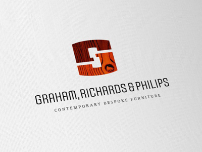
The mark forms all 3 initials with emphasis on the 'G', as Richards & Philips are now retired. The 'G' actually can be seen as a uppercase G or a lowercase 'G'. The 'r' and 'p' both being formed from the same upper portion. Hence the colour split.
Idea was to also create a subtle impression of a piece of furniture, possibly a table top, the wood texture helping keep the logo firmly in 'tradition'.
You can rotate it and it still reads the same. Bambigram. :)
The font is the same overall shape as the mark, with domed/curved tops. Again, breaking from the traditional 'serif' Trajan style typography seen with many furniture logos, a reversal with fonts. The tag line doing the serif duty. It's not immediately obvious, but what I am trying to achieve is, 'have to think about it, then see it'. Don't want it easy or boring. The mark will also be engraved onto a metal badge to fix to each item of furniture.
Anywho, early days. :)
