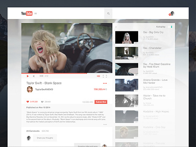
YouTube Website Redesign
Please check the Attachment for Full Resolution.
So I started looking at the current YouTube website, and saw lots of clutter in the user interface, things that make you just watch the video in fullscreen and skip the entire YouTube experience as a whole.
This is my take on YouTube, elegant and pleasant to look at and interact with.
Hope you like it too.
Thanks and have inspiration.
More by Fabian Albert View profile
Services by Fabian Albert
Like

