Glacé aux fruits - branding
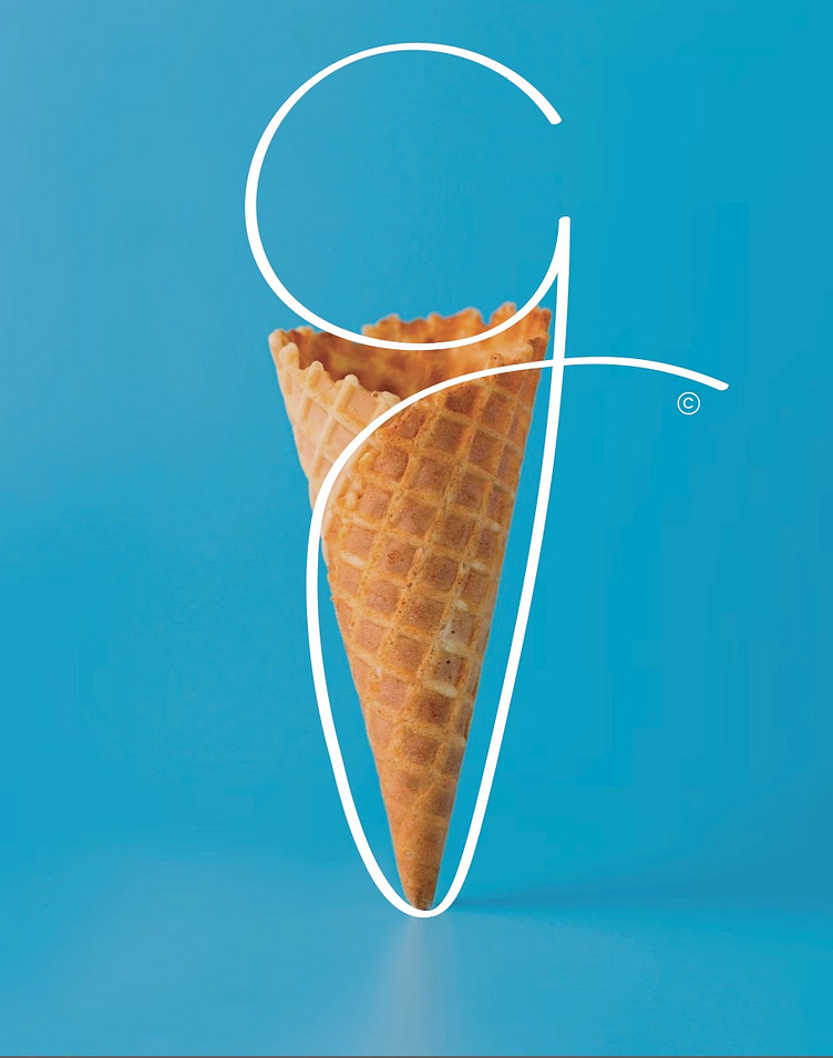
I developed this branding in line with the customised 'g' typography of Glacé aux Fruits which I designed to mimic a scoop of ice cream on top of a cone - the circular top of the 'g' which swiftly and smoothly meanders down the cone like shape. This branding can be used on large posters marking the Parisian ice cream parlour, and is equally effective in small print on serviettes and business cards.
Tools used:
Adobe Illustrator
Adobe Photoshop
Bēhance: https://www.behance.net/naomi_heyes
Adobe Portfolio: https://naomiheyes10.myportfolio.com/
Not for use without permission. All right reserved.
