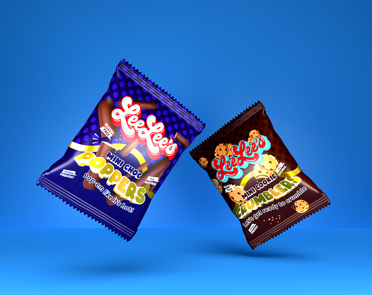
Chocolate Fingers & Cookie Snack Packaging Design
The Brief
Lee Lee's goal is to produce healthy and satisfying vegan snacks without the use of any harmful ingredients or preservatives. The founder was motivated to create healthy vegan snacks by his or her own health issues, and original recipes made with only plant-based ingredients were the result. To experience vegan bliss in every bite, you must try Leelee's.
The Keywords
Snack, Chocolate, Fun, Loud, Bold, Purple, and Gold Keywords
The Design Solution
I made sure the packaging I designed stood out from the rest by using bright, primary colours and a lively pattern. With the intention of drawing attention to the product, I opted for a minimalistic design that made use of some whimsical graphics and illustrations to convey the lighthearted spirit of the brand.
I used a large, bold typeface to draw attention to the product's name as one of the primary design elements. The brand's goal is to provide consumers with high-quality products, so the typeface was selected for its playful and modern appearance. The design makes it simple for consumers to understand the product they are purchasing by clearly outlining its ingredients and nutritional data.
As a result, the brand and packaging were well-executed in terms of aesthetics and practicality, conveying the company's dedication to delivering superior goods to customers. The branding was clear and concise, and the product's catchy colours and engaging illustrations attracted customers.
The Conclusion
Lee Lee's packaging design was a huge hit because it accurately reflected the brand's personality and values while still satisfying customers' expectations for premium goods. The completed packaging design was both aesthetically pleasing and practical, increasing brand recognition and sales.


