Roat - Logo Proposition 2
What does the Roat do?
ROAT is a marketing agency specialized in writing Web Content for businesses and individuals.
Concept 〽️
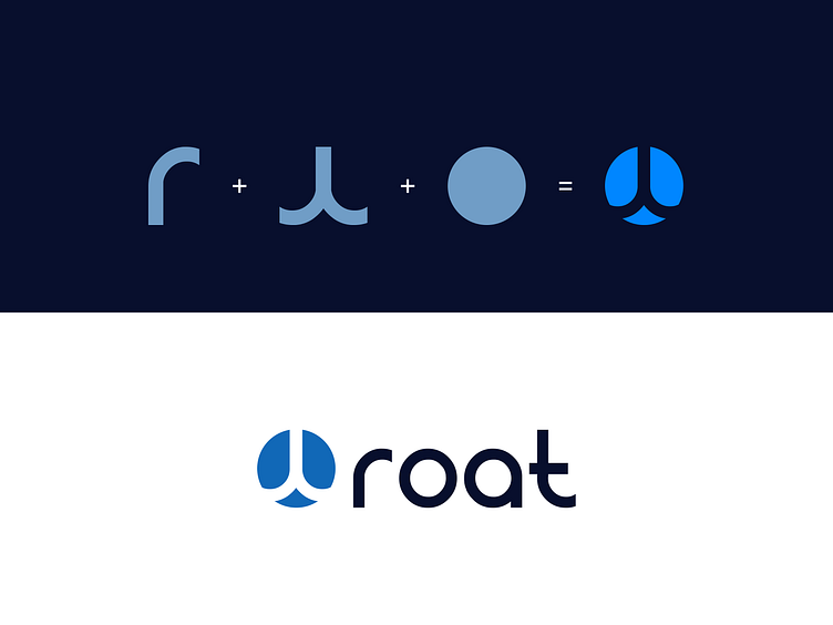
The logo is well designed and proportionately constructed.
The icon has an individual meaning behind it.
We studied the basic shapes and used them in the logo to incorporate two letters "r" turned upside down.
This arrangement builds a tree with a root silhouette that is clearly visible because the company name "ROAT" comes from "ROOT".
We have used the royal blue as a symbol of reliability and competence.
Happy to hear your thoughts and points of feedback.
Happy new year everyone! Let's make the year 2023 more creative!
___________________________________________________________________________________
___________________________________________________________________________________
Want to work with me on your project?
Feel free to reach out via DM or email:
🔗 Follow me on Instagram / See BTS and New Content
💼 Connect with me on LinkedIn
