Reusable Card Component
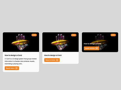
Creating a reusable card component with specific properties in Figma can greatly enhance the ease and efficiency of editing the card across multiple platforms. The properties in question include a variant, which allows for different styles or layouts of the card to be used, a boolean, which allows for certain elements of the card to be turned on or off, an instance swap, which allows for different images or icons to be used within the card, and text, which can be easily edited and changed within the component.
One of the major benefits of using a reusable card component with these properties is the ability to make changes across multiple platforms with minimal effort. For example, if a new image or icon is needed for the card, the instance swap property can be utilized to easily swap it out without having to manually update each individual instance of the card. Similarly, if changes need to be made to the text within the card, the text property can be easily edited within the component, which will propagate the changes across all instances of the card.
Additionally, the variant property allows for different styles or layouts of the card to be used depending on the specific use case. This can be especially useful for creating a consistent look and feel across different platforms or applications, while still allowing for flexibility in design.
Finally, the boolean property allows for certain elements of the card to be turned on or off, which can be useful for creating different versions of the card for different contexts. This allows for greater flexibility in the design and functionality of the card without having to create multiple separate components.
Overall, creating a reusable card component with these properties in Figma can greatly streamline the editing and updating process across multiple platforms, while also providing a high level of flexibility in design and functionality.