Task tracker

Task tracker
This was an interview take-home assignment that I completed remotely in a week. The product is a mobile app that provides recurring and one-time services such as cleaning, painting, moving, and general handyman tasks.
Research
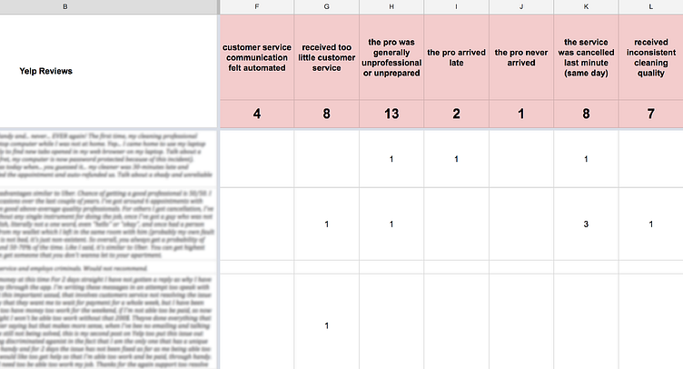
I sifted through hundreds of the app's online reviews, broke each review down into its basic complaint, and tallied them. The recurring issues in the app's user experience became clear, and I got a feel for the priorities, lifestyles, and circumstances of its users.
For my purposes, this method worked well, and now, the reviews are archived and searchable by keyword and exact phrases. But it was also time-consuming and with better tools, this data could be generated automatically and visually. Some other considerations: my method for breaking down reviews was subjective and this data is far from comprehensive.
I also booked a service through the app to experience it as a first-time customer. This was incredibly insightful, and I got firsthand experience with the anxiety that I'm trying to relieve through design. I also wanted an opportunity to interview a handyman in person. All of my notes from research and interviewing were collected in a Google Doc along with other information that I found through an internet search for publications and articles relative to the cleaning service industry.
User personas
At this point, I had a few general customer profiles in mind.
The first time customer
She found this service app through an internet search or advertisement and decided to give it a try for a specific one-time handyman task. She doesn’t know what to expect and will definitely be present for the service.
The referred customer
He heard about this service app through a friend, and is therefore giving it a try for the same service his friend had purchased. His expectations are generally higher and his stress is generally lower than the average new customer.
The busy working household
They travel often or work long hours and manage the household — leaving little time for home cleaning and other household tasks. They’re looking to automate their life and save time through a recurring service in order to reserve more time for their passions, work, and relationships.
Brainstorming
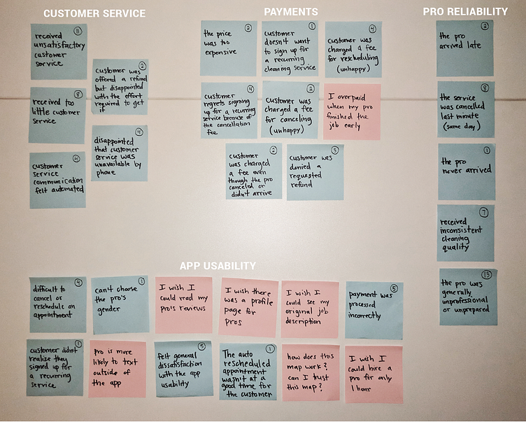
I extracted 23 points of feedback from my research and tallied them on blue paper. For the pink papers, I wrote seven points of feedback based on my user interview and personal experience as a first-time customer. Then I grouped and regrouped these until I understood some of the high-level problematic areas with the user experience.
Research findings and open questions
Customer service
How might we improve this experience? How might we communicate in a more human way and sound less automated? How might we ensure that our customers feel taken care of? Which companies in the world are doing the best job at customer service? Should we implement any of their methods? What methods have we tried in the past? Have we made recent changes to our customer service? Why don't we offer customer service over the phone? What kind of positive feedback are we getting about our customer service?
Payments
Payments are confusing and often aggravating. How might we give customers more transparency? How do we ensure that payments and refunds are fair for the service received? How do we justify the cost of our services? At what point do we offer refunds or discounts?
Pro reliability
How might we create more consistency among professionals? What kind of resources might help establish better preparedness? How are professionals currently trained? What are their current requirements? What does it mean to be a "vetted professional"? Last-minute cancellations are happening often. What are the biggest reasons for this? How might we prevent them?
App usability
How might we ensure a quality fit between pros and customers? Why don't we allow the customers to read reviews before booking? How might we bring clarity to the process of agreeing to a recurring service? What other features are on the roadmap? What’s the most useful information that we’re not currently giving to customers? How might we make this information highly accessible? Why are services booked for a two-hour minimum instead of a one-hour minimum?
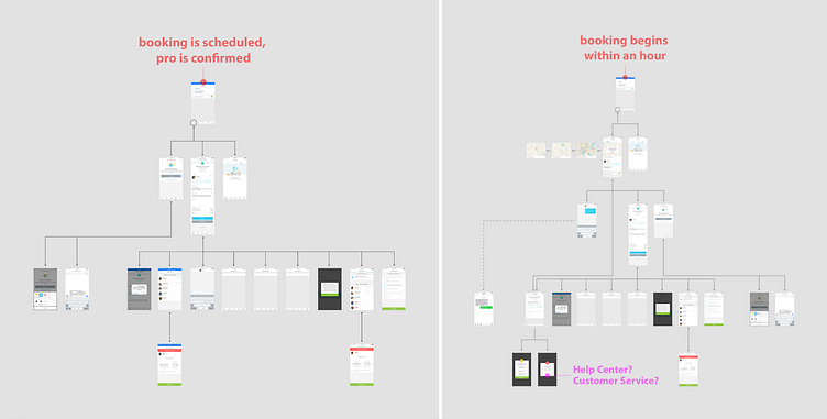
User journey
I mapped out the screens of the mobile app to understand how users are navigating through it to answer questions like: Is my professional on the way? Are they running late? If so, how late? If they don't show up, what do I do? Can I trust who's coming? Has the professional arrived? Did they get in alright? How much progress have they made? Has the professional left?
I learned that the most accurate way for a customer to answer these questions is by sending a direct message to the service person that was hired and hoping they have good cell service and time to respond—two things we can’t guarantee. How can we eliminate the need for so much back and forth messaging between the customer and the pro?
I also learned that the Help Center is the user's best resource for relieving anxiety about an upcoming service. But its not super accessible. To find it, one must navigate to the profile page and then scroll down to find its link. For me, this wasn't intuitive. An alternative way to find the Help Center is by booking a service, but it only becomes accessible once the customer is four or five steps through the booking process. Another issue with the Help Center is that it's not built into the native app but instead is hosted by the accompanying web app. Therefore, the navigation is confusing. In my experience, I would accidentally land back in the native app when I was trying to search through the Help Center in the web app. Then I would have to start my search all over. How could we restructure this Help Center and increase accessibility? How can we make its contents easier to search and digest?

Design ideas
An updated Help Center
A more effective FAQ/Help Center could foster greater trust in the app, bring more clarity to customers, and lighten the load for customer service.
A profile page for the professionals
By giving customers an early opportunity to read the pro's biography and reviews, we could foster trust and relieve some of the anxiety associated with allowing a stranger to enter your home. We could also prevent mismatches between pros and customers. For example, perhaps the pro always provides good service, but often arrives late—important information for anyone hiring this pro.
Fix or lose the map
During my experience as a first time customer, the map screenshots influenced much of my anxiety leading up to my service. Maybe the map should be updated to display real-time information instead of periodic screenshots.
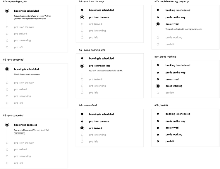
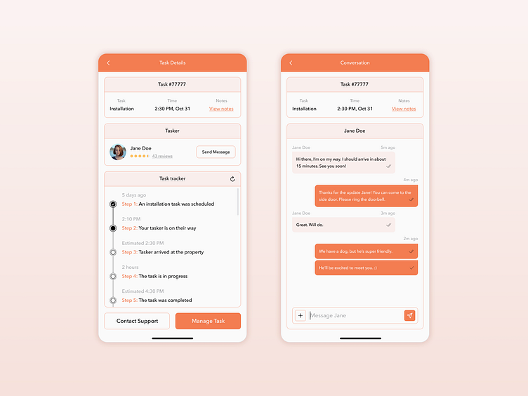
A progress tracker (I went forward with this one)
For the user, it would display a series of steps: task is booked → pro is on the way → pro arrived → pro is working, and each task would be shown as incomplete, in progress, or complete.
Tracker wireframes
This feature is designed for the customer facing experience. It's not interactive and would update automatically. Questions at hand: what's the complete skeleton of the service experience? What are all of the potential scenarios that occur during a service? Did I address all of the major ones? Is this interface anticipating the emotional needs of the customer? Is this technically feasible? Is this a stress-free and rewarding experience? How does this feature affect the professional? Is this interface intuitive and familiar? What problems have I solved? Which problems haven't I solved? Have I created any new problems? Am I showing the right data? Enough data? What technical issues might we encounter?
User interface design
In my visual design process, I reimagined the look and feel of the app. This was mostly about flexing my visual design skills. In retrospect and since this was an interview take-home assignment for a full-time in-house product design role, I should have designed this feature to fit in and match their existing app and design system. This project was done in 2017, and I had never had a real product design job before. I didn't fully know what I was doing.. just shooting my shot.
Conclusion
The company interviewing me took over six weeks to schedule me to come in and present this interview assignment. They didn't pay me for my time and had given me a real problem to work on that they were actively solving. They showed up about a half hour late for my presentation. The lead designer wasn't there. They gave me zero feedback and no job offer. Really not a cool experience.
However, adding this project to my portfolio led to many new interviews and ultimately my first full-time job offer as a product designer at Flatiron School.