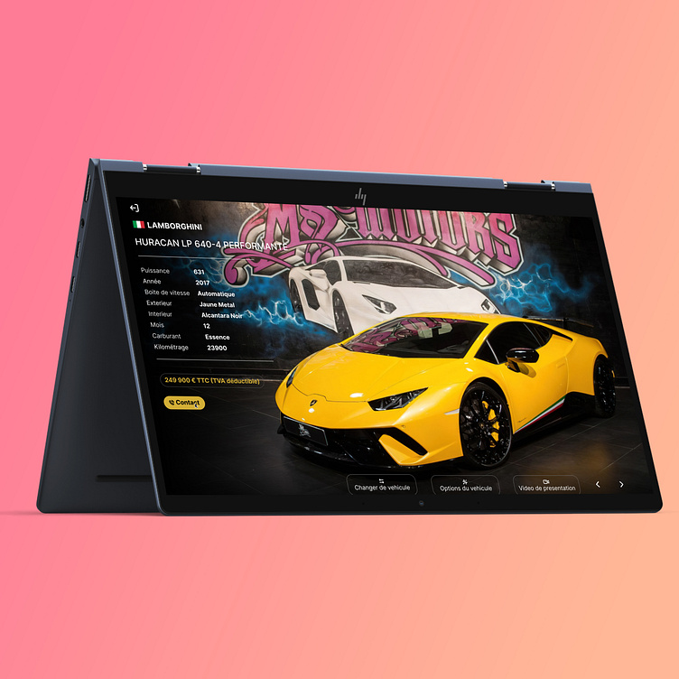
HOW I DESIGNED A GRAN TURISMO CAR DEALERSHIP WEBSITE
WHAT?
A car dealership website inspired by the legendary videogame *trumpets* Grand Turismo
THE PROBLEM
Most car dealership websites fails at one particular thing : - EMOTION -
In such a high ticket entry marketplace, the user experience with the interface is more than crucial.
Lets face the truth :
The automotive world is passion driven; people don't get lamborghinis for rational reasons. They get it because... well... ITS A LAMBO !
Its fast, menacing, loud, expensive, drinks fuel like water... nothing rational here, just -emotion-.
You understand now why being able to induce positive emotions and a smooth experience to the user is a key strategy in building a website that attract buyers. Yet, so many car dealership websites don't do that.
THE SOLUTION
The key here was make the website appealing, interactive and intuitive for both the passionnate and the regular user.
Using a videogame as a template allows the interface to be intuitive and welcoming. The data is shown in a minimalist optimized way, so the user get all the information needed without being overwelmed.
The interface uses strong contrast for better readability, and emphasizes on images. The user wants to browse throught cars and look at them without big texts jumping on the screen.
Any car person is able to get that Grand Turismo reference, thus benefiting the overall experience. Even if you know nothing about cars, you enjoy an effective, smooth, pleasurable user experience.
The dealership color chart (black and gold) is used on the interface
My work is based on MSMOTORS; one of the biggest car dealership in france, and truly an amazing garage.
Emotion you say ? its all over the place : They sell luxury, performance and tuners cars, and honestly have one of the best pieces in their showroom.
Leave a like :)❤️
Contact
Have a project in mind? Let's work together!
Follow me on Instagram
Contact & business inquiries : gadstudiopro@gmail.com


