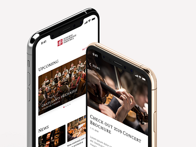
Philharmony App - UI and UX of Booking and Ticketing System - 2
A closer look under the hood of our app proposal for our hometown philharmonic orchestra. Minimal UI with a clean typography, together with imagery, does most of the design. The flow chart shows the app's structure built with the easy user experience in mind. Look into our case study for more.
👉 Full case study (It's worth it! 🔥)👈
Don't forget to leave a like (press “L”) ❤️. We would like to hear your feedback as well 💬.
More by nextap solutions View profile
Like


