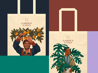
Case Study: Garden Center Packaging Design
Take a deeper look at the graphic design and digital art project inspired by the beauty of flowers, leaves, and blossoming nature: check the packaging design and a set of bright, atmospheric illustrations developed as a part of the brand identity for the plant nursery selling plants and gardening stuff. Catch the mood!
Identity and Packaging
The logo design for the project presents the combination mark in which the symbol echoes botanical motifs elegantly organized in a square shape, and the typographic part sets a strong visual connection with it using the same leaf shape as a part of the letter. The color palette features the domination of earthy natural colors, with different shades of warm, eye-pleasing brown for backgrounds and contrastive bright blue, green, yellow, and other shades for accents and details, distinguishing different products and goods by color marking. This approach can be seen in a variety of packaging design items.
Brand Illustrations
The consistent set of illustrations developed for the project features a variety of people and characters holding different plants or dealing with gardening routines. Digital artworks of this kind add a solid human element to brand communication and make it more emotional. They can be effectively used for a variety of marketing goals, from printed branded graphics such as posters, banners, cards, and stickers, to packaging design such as various branded boxes and bags, to digital communication on a website, landing pages, and social media posts. The consistency of the visual approach helps to create an integral customer experience and strengthens brand recognizability.
Also, welcome to check:
• the diverse collection of tubik design case studies
• the illustrations about technologies for the disabled
• the illustration art inspired by architecture
• the set of artworks inspired by wildlife
• the big collection of people illustrations
• the art on workspace and creativity
• the illustrations about love and romance
—
Tubik | Tubik Blog | Behance | Instagram | LinkedIn


