Preteen (re)Brand
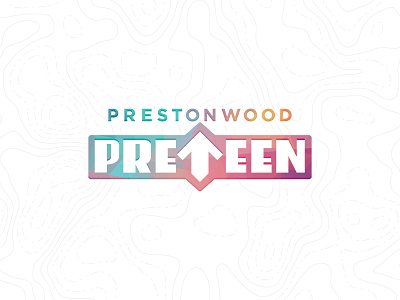
Endeavoring on the rocky road of (re)branding/logo design here at work. They want "unique type, an up arrow, and something with a modern industrial feel."
Trying to avoid cheesy/cliche/contrived up arrows, but this was an iteration I kind of liked. Haven't even gotten to initial review yet, so who knows if this will live much longer.
I always start out logos and icons working in black and white, but wanted to dress this up a bit before I posted it, hence the dimension and poly colors.