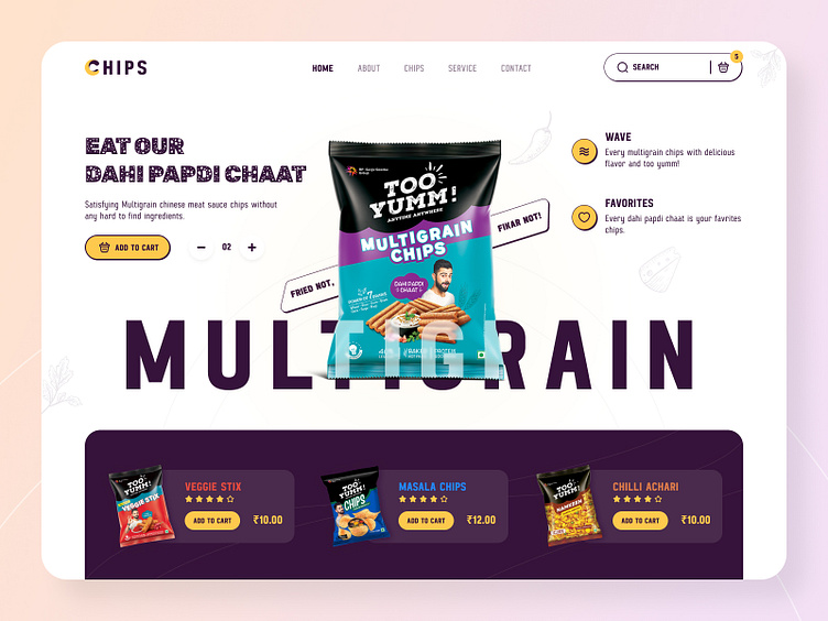
Chips Website Design
Hello Guys 👋 !!!
Today we would like to shine some insights on our full-fledged Snacks Product website. We tried to make a website that is minimalist, modern, and easy to use without any distractions.
In Homepage was deliberately chosen in order to captivate the user from the first seconds of the visual web. We didn't use abundant design elements, so the eye doesn't stumble or get stuck, but comfortably sinks.
Colour Scheme
The yellow and midnight blue colour palette of the CHIPS logo represents energy, power, and passion, which concentrates on the quality and flavour of its product.
Feel free to share your thoughts in the comments 💬.
Show some love by pressing “L”, and Save It for later inspiration.
We are open to new projects! 👉 Contact Us
Follow us: Behance | Instagram | Dribbble
Thank You 😎
