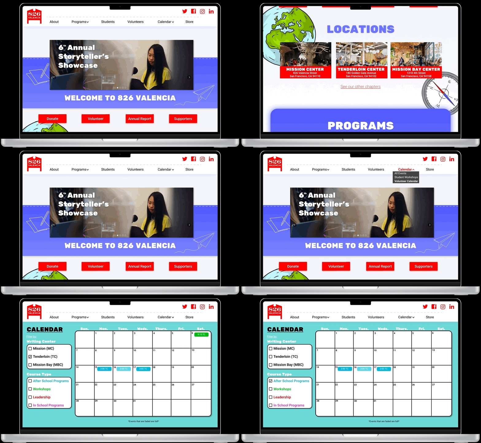
826 Valencia Calendar Redesign
Above is a quick Gif that highlights some of the alterations made to the original 826 Valencia Site. Redesigned homepage, navigation, and new Volunteer calendar.
Above you will find our heuristic evaluation of the original calendar on the site (Slide 1). After this was completed we created a lofi redesign based on testing and the direct request of the stakeholder (Slide 2). The colors make it easier for the user to navigate as found in our testing, also the separate filter showing which location had which course, and the faded color represents classes that were at volunteer capacity as you can see in (Slide 3).
Above is the user flow created to model the new user flow to get users to our volunteer calendar more efficiently. We noticed in testing after our stakeholder mentioned as well that volunteers had a difficult time finding the calendar, as well as what classes were available.
Above is the lofi of our new homepage. New outline making the volunteer calendar more visible, as well as showcasing each of the locations. Which was a problem before.(Slide 1) Next, is our HiFi mockup with our colors and actual photos of the locations. The Stakeholder stated she wanted to see a more playful experience on the homepage. We tested limits with animations and more vibrant colors. Used fading of certain outlines and more playful shapes.
Our User Persona after conducting our testing, and speaking with volunteers and our stakeholders we realized josh was out target user.
Matthew Coffey Roles: UI designer, Prototype designer, Interviewer, Writer


