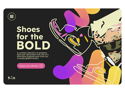
Mock Shoe Company Homepage
💭 Imagining if I had company that sold sneakers 👟 Kix
🎨 Playing around with fun colours and illustrations to set a bold tone for a homepage of a business that sells artsy sneakers.
🔎 Presenting minimal navigation (hamburger menu). Seeing this trend on websites a lot at the moment so wanted to emulate a mobile interface with that symbol.
What do you think?
Always happy to chat design ideas, feel free to reach out on LinkedIn :)
More by Chloe Dare View profile
Like
