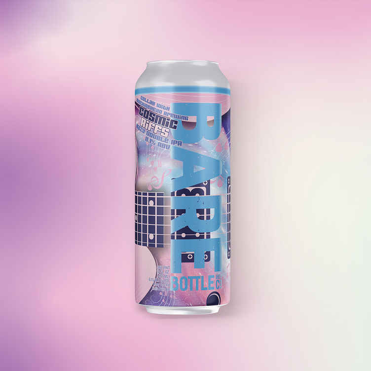
Cosmic Riffs - Craft Beer Packaging Design
I'm excited to share this tasty collaboration brew design. Crafting a label for a beer that is a collaboration adds another layer of complexity. It is a great challenge. The goal is to communicate all the information within the first few seconds of being seen by the consumer. The visual hierarchy of our labels is as follows.
1. The Monolith - The large brand block that says "BAREBOTTLE Brew Co." acts as the anchor on to which consumers attention is latched.
2. Beer Name: A bit obvious, but they need to know the name of the beer quickly
3. Style & ABV: These two pieces of info quickly help a consumer parse out which can they are looking for. For example, are you looking for a big beer with high ABV? This one is for you!
4. The collaboration callout. The Clincher of the design. This unassuming phrase calls out that this beer is special. A synthesis of two great breweries.
Cosmic Riffs
The Visual Flavor of Cosmic Riffs
How do you communicate flavor thru the visual design of the packaging? Color first and foremost. This hugely hoppy beer is designed to be soft on the palette with tropical notes of citrus and passionfruit. To create this flavor I paired soft tropical pinks & purples with crisp cosmic blues.


