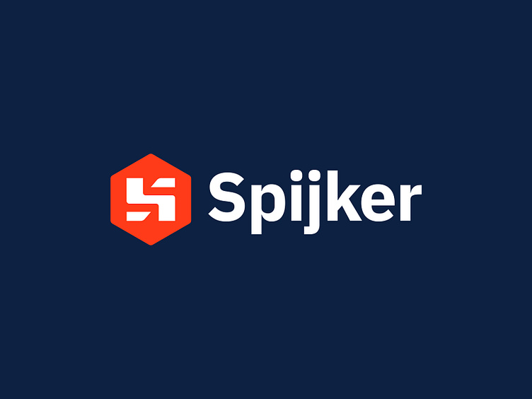
Spijker - Logo Design (carpenter)
Logo design for a Dutch carpenter called Spijker. Meaning, a nail (in Dutch) and also refers to hamer (which can be seen in the S logo mark). It's subtle and bold concept combination that I felt kina working well together.
Happy to hear your thoughts.
Have a lovely new week, everyone!
Jeroen
___________________________________________________________________________________
___________________________________________________________________________________
Let's work together and elevate your brand
Feel free to reach out via Dribbble DM or E-mail:
👉 info@jeroenvaneerden.nl
💼 Connect with me on LinkedIn / Read my Client Recommendations
🎬 Check my YouTube for Logo Tutorials / Learn Logo Design
🔗 Follow me on Instagram / See BTS and New Content
💬 Tweet with me
