Where 2 Charge — UI Design
ENGLISH
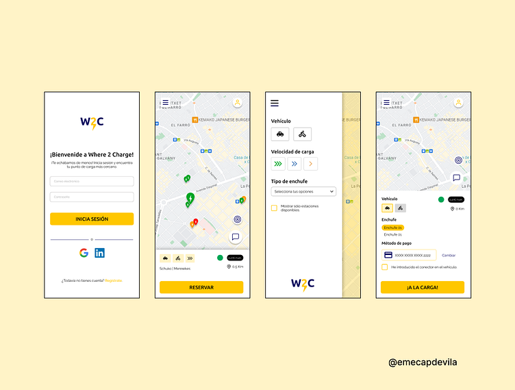
Here we can see the final look & feel of Where 2 Charge (W2C). Mustard yellow was chosen as the main color due to its neutrality and, at the same time, yellow's historical relationship with electricity.
On the second screen of this slide we find the W2C home or main screen, where the nearest charging point to our location is automatically marked. In the card of the point we can find all the information that the user may need:
Vehicle type (car and motorcycle)
Charging speed (fast charging)
Plug types (Shuko and Mennekes)
Availability (green circle)
Charge rate (€0.27/Kwh)
Distance to which the point is located
By opening the menu we can change our preferences, so that the application would only show us the charging points that comply with them.
Finally, after selecting and completing our preferred payment method, we can use the App to start recharging our electric vehicle.
ESPAÑOL
Aquí podemos ver el look & feel final de Where 2 Charge (W2C). Se eligió el color amarillo mostaza como principal debido a su neutralidad y, al mismo tiempo, a la relación histórica del amarillo con la electricidad.
En la segunda pantalla de esta diapositiva encontramos la home o pantalla principal de W2C, en la que se marca automáticamente el punto de recarga más próximo a nuestra localización. En la card del punto podemos encontrar toda la información que el usuario puede necesitar:
Tipo de vehículo (coche y motocicleta)
Velocidad de carga (carga rápida)
Tipos de enchufe (Shuko y Mennekes)
Disponibilidad (topo verde)
Tarifa de carga (0,27€/Kwh)
Distancia a la que se encuentra el punto
Abriendo el menú podemos cambiar nuestras preferencias, de manera que la aplicación solo nos mostraría los puntos de carga que cumplan con las mismas.
Finalmente, tras seleccionar y completar nuestro método de pago de preferencia, podremos utilizar la App para iniciar la recarga de nuestro vehículo eléctrico.
