Data Representation Dashboard Design .
Tried to create a Dashboard that represents weekly data of viewers and subscribers reaching through various online platforms to the blog posted by one of the user on a blogging app.
https://www.figma.com/file/xpZfp5HxIlSV8jCBcSw3tZ/Post-Up-DASHBOARD?node-id=0%3A1&t=alRLwjOGW632qmPj-1
This Dashboard is designed in Figma which includes:
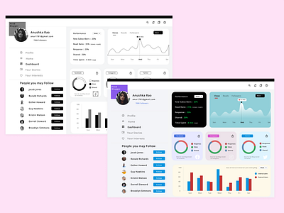
1. Weekly Performance Card that shows performance of blog and new subscribers ratio.
2.A curved Graph depicting number of views for the blog with highest view on a particular day.
3.Doughnut graphs represents the ratio of responses, views and shares through various social platforms such as Facebook, Instagram, Twitter.
4.Bar Graphs represent the internal vs external users visiting the blog.
5.Side Bar with a menu and recommendations of the connections.
