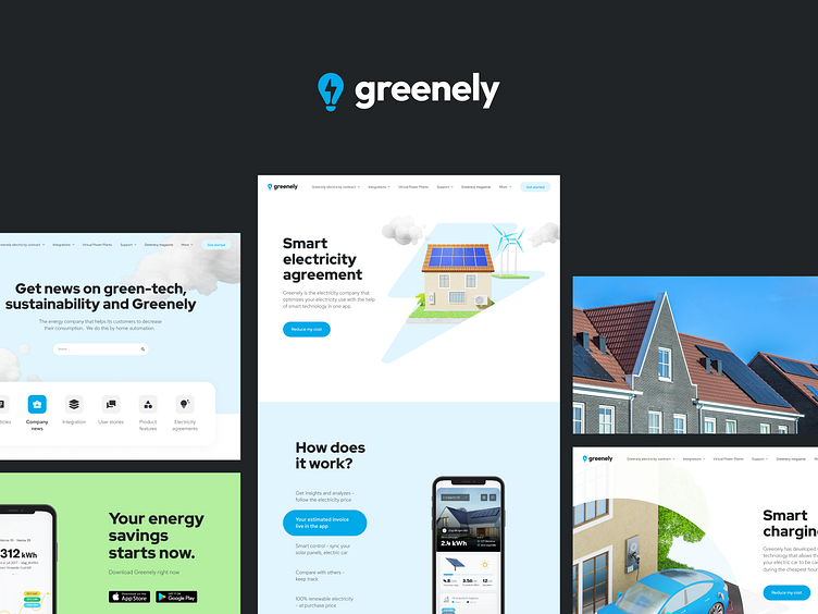
Greenely — UI/UX design for a smart energy company
Disruptive technological player in an old industry
Greenely is a smart energy supplier of the future, using smart technology to optimize the customer's electricity.
The Company is currently one of Sweden's fastest-growing energy suppliers with over 120,000 connected homes, of which over 18,000 are paying electricity customers.
Greenely’s service is based on its mobile app, which enables the user to reduce electricity consumption and minimize the cost of electricity. The user can easily switch to Greenely’s electricity contract directly in the app.
For a monthly or annual fee, Greenely offers green electricity at a purchase price. The app's smart functions allow customers to adapt their electricity usage to the lowest daily electricity price, reducing the electricity cost.
Let's talk more about the main goal of the project and our results 👇
The main task
The primary mission of the project was to redesign the existing site. The client wants to showcase that they are disruptive players in an old industry. Therefore, they want to show and express the feeling that they are a modern technology player changing how we consume energy (thanks to digital and tech approaches). The client does not want to make it feel “too complex” for everyday consumers.
Last time we have shown you a design of the main home page with 3D elements. Today we want to shed more light on other parts of the project.
Our solution
After researching and analyzing the market segment and the target audience, we offer a minimalistic and clean design style.
Eye-pleasing colors (white/ light gray/ blue), readable and concise description text, well-balanced visual hierarchy, and minimalist and airy web layouts make the pages clear, visually engaging, and emotionally appealing for users.
Also, the website has bright accents effective color combinations and different types of contrast.
3D
We created unique 3D models to show all applications' functionality. Studies have shown that a person remembers 15% of the information he receives in speech form and 25% in visual form. It’s easier to user see how it works than read it. Also, 3D images capture users from the first seconds of interaction.


