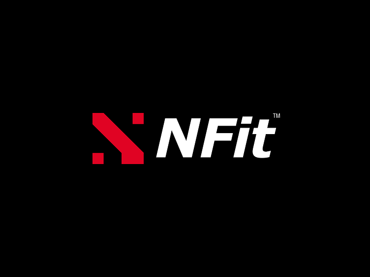
Nfit - Logo Redesign
Nfit Logo Redesign ideas 🏋️🥇
NFit™ is a sports brand that aims to change your attitude towards your body, getting to know it in a completely different light through bodyweight based exercises, mainly running. It is created for athletes.
The symbol created is just an abstract shape of a foot in motion while pressing the first letter of the mark "N".
The font used is italicized because it is a dynamic brand.
What do you think of the concept behind the logo? Is the logo simple and recognizable?
Have a great week full of endless possibilities! ⚡
Let's work together and elevate your brand
Feel free to reach out via Dribbble DM or E-mail:
More by Anzeez Laguide View profile
Like


