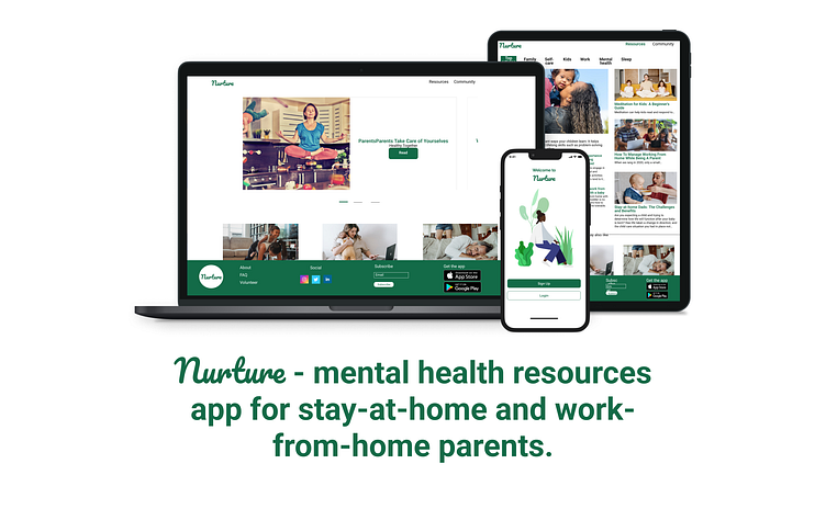
Nurture
User Research: summary
During this design process, I conducted three qualitative research: one session of user interviews and two usability studies. My goal for the interviews was to talk to parents from different backgrounds and age groups. One of my biggest insights was just how lonely SAHP and WFHP are and how big their need to connect is.
During the usability studies, it became clear that the options to connect with others and to be able to find and book appointments with mental health professionals would be greatly appreciated.
Competitive Audit
A quick online search showed that there are currently no direct competitors on the market, so for my competitive audit, I chose apps that tackle mental health like Headspace, Calm and Room For Her. The lack of dedicated apps for SAHP/WFHP made it apparent that a considerable gap needs to be addressed.
Starting the design
Digital wireframes
Low-fidelity prototype
Usability studies
Refining the design:
Mockups
High-fidelity prototype
Accessibility
High-fidelity prototype
The high-fidelity prototype is an expanded version of the low-fidelity prototype, that includes changes applied after the usability study and a login screen.
Responsive Design
Information Architecture
Responsive design


