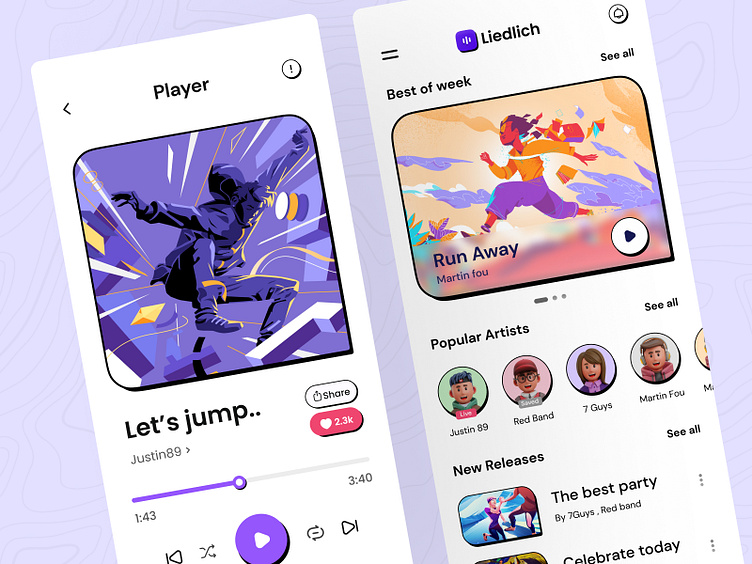
Music player mobile
Hi, happy new year👋
This is one of my previous projects that I had not the chance to publish yet.
A music and podcast streaming app like all similar apps like Spotify, Soundcloud,...
This was the biggest challenge for me, because all designs are same and repetitive and there is not enough opportunity for new creative chooses. But, after a few days of checking and testing spotify and soundcloud applications, I found some of their basic problems [mostly in the player section] and in my design for the Liedlich application, I made it much simpler and more useful.
I hope you have the same opinion 🙂
If so, please press F or L to like it🙏🏻
Let's Connect!
Here's my LinkedIn account so we can connect.
You can also contact me via email: r.koohi99@gmail.com
or Telegram direct message: @doctordesign 💬
Neubrutalism style
Now I want to talk a little about this style. Because I think this style is very efficient.
In this style, we shift the user's focus to CTAs and Cards. CTAs and cards are the first point of focus of the user in the Neubrutalism style, and this is very important in marketing.
In the styles,
that have been introduced in recent years (I mean successful styles), simplicity is the most important. Maybe the styles we will see in 2025 will be even simpler than this. [Even the thought of it is annoying.😡]
But I think this style has more chance to survive and improve in the coming years. Because it has both minimal and attractive factors together.
I remember obsolete styles like Neomorphism had only one important factor and in the end they didn't have a long life.

