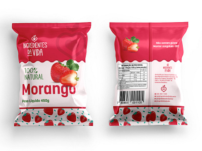
Morango or Dried Strawberry packaging
This was really fun project. Since the product is Morango, it had to be vibrant like it's own color. I tried to follow the theme of the product by using the red and some green tint. Client wanted to have the real image on the front side so that his customer can easily identify the product inside. I had to place the image creatively thereby it becomes more prominent.
The client was over the moon getting the final result.
More by Packaging by Tarek View profile
Like
