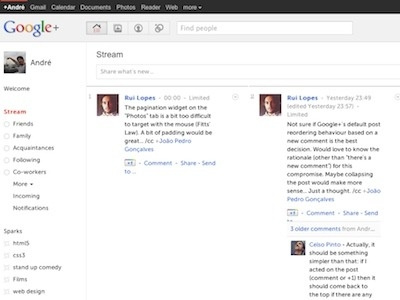
Liquid & Responsive Google+
I couldn't live with the one fixed column layout on Google+ so I wrote the userstyle to make it:
1) liquid
2) responsive
3) multi-column
Yes, it's wonky... the percentages sometimes cause the sidebar to fall underneath, but I'll improve it.
More info:
https://plus.google.com/108648500676303310651/posts/cMpUZd7EegA
More by André Luís View profile
Like
