Okticket
Brand redesign and product developing of this business spending solution.
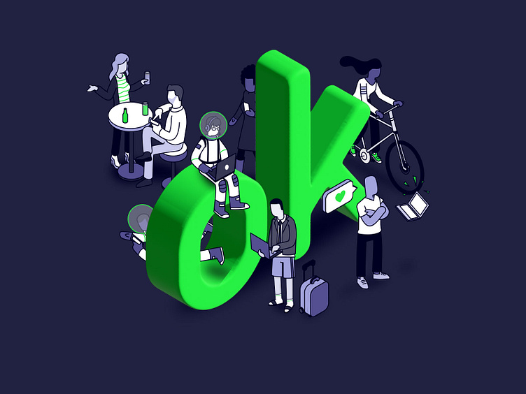
Creation of a microworld which represents and communicates processes and values through corporate illustrations. Also, creation of new iconography, in line with its new style and new style guidelines.
We have develop an entire redesign, integrating everything into their product, (app, web manager and corporate website) building a dynamic and different experience for the kind of user of an accounting app.
Updating the app
From the login to the new features, we can make the difference applying new resources and making little changes, to bring a whole new product for current and new users.
Receipt signed animations
One day, Oktikcet CEO came to me with a brilliant idea: Can we make funny and silly animations when a user completely registers a file?
So we ask all the team to put ideas in common, and here are the first animations for that process. Maybe there will be more in the future!
Web redesign
Making a whole new corporate website for their brand, also applying app changes into the Admin web panel. Using illustrations and animations, you can navigate through a site which take care of its user experience.
Full details
Even when a user doesn't have any data uploaded, the App shows an illustrated screen for each empty section. Little things that make the difference.
The OKT Card
One of the Okticket last features, the OKT Card: a smart debit card to get instant notifications of expenses, reporting details with just one picture of the receipt.
After some sketches and ideas, we finally choose one and made the illusion card: there's only UV print for the illustration, so you only would be able to see it with the reflection of light.
In the meantime, we have to design the app and web integration, and create our biggest character: Tarjetín, the living OKT card.


