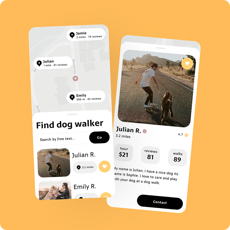
"Dog Walking" Case Study
Hello 👋, My name is Andi, I am a graduate of the Dribbble Product Design course. I do iOS and Unity Game development with 6 years’ experience. In the last couple of years it became very valuable for my day to day work to enhance my developer skills with product design. At my work I built many minimal viable products (MVPs). That's why I build my case study as a minimal viable product.
In order to constantly improve, feedback is extremely important to me in my personal development as well as in the product design process. Therefore, please do not hesitate to leave me feedback.
Case Study Brief
My case study is about a dog walking iOS app. Dog owners can find the best dog walkers to buy their service of walking with the dog.
Mostly I develop iOS and Unity Games from scratch. Therefore, I am pretty experienced to develop minimal viable products. My case study "Dog Walking" is about a minimally viable product.
My Role
Before this course I finished the UI design course to learn new skills to design in Figma and collaborate in a multidisciplinary team from a product designer's perspective.
As a graduate my role has been to learn the whole product design process in its essence. My 12+ years overall experience in development gives me a strong understanding of the principles to dive deep into this new experience. After 20 weeks at Dribbble courses I took the passion with me to enhance my developer skills with product design know-how. I can't wait to learn even more about researches, ui/ux, visual design and reviews. ❤️🚀
User flow
The user flow focuses on each step in the design process, and not so much on the experience of an individual user. A user journey is better suited for this. As I focus on a minimal viable product of the "Dog Walking" iOS app, I only want to design the user flow of the most important audience, which are the dog owners.
I avoid long onboarding of new users, instead a user can look for a dog walker right after opening the app. At any time, the user can share his/her location to get dog walkers near them. A new dog walk can be arranged via message chat. The dog walker shares a payment link via message.
Wireframing
Before I get into visual design, I explored the ui/ux of the user needs with many iterations of wireframes. I discussed the iterations together with the users and the multidisciplinary team. Because of my focus on a minimal viable product, I paid special attention to the easiest onboarding of new users.
I had to overcome two challenges in the process:
1. The user's best experience is to get a list of dog walkers near him. But how to convince a new user who doesn't know us to share his location?
2. What is the most valuable information for the user who leaves his best friend, the dog, to a dog walker who is still a stranger?
Onboarding
Finding a dog walker
Finding a dog walker without sharing location
Visual design


